Jules Skopp
Hello
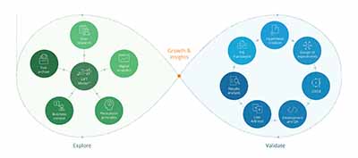
I'm an executive product leader with a passion for data-powered experiences. Co-founder of Design Leadership Therapy and a speaker on data, leadership, and product strategies. Download my resume
Leadership
Great teams don't just happen—they're built. With empathy and transparency, I cultivate collaboration, empower diverse talent, and create a culture where innovation thrives.
See impactProduct strategy
From vision to execution, I help teams navigate complexity, turning bold ideas into scalable products. Lean-certified and impact-driven, I shape strategies that move businesses forward.
Explore innovationsData expertise
Data isn't just numbers—it's a competitive edge. With a decade of experience, I transform insights into action, driving smarter decisions and sustainable growth.
Discover insightsProjects
You found a project I haven't worked on yet. Wow! Show all projects
-
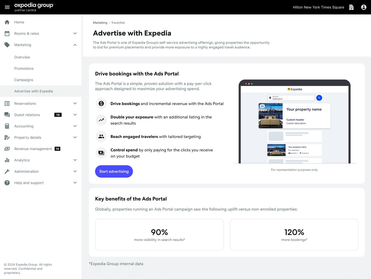
Advertising
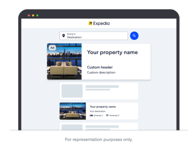
Travel Advertising E-commerce AI/ML Growth Strategy B2B2CJanuary 15, 2025 | Expedia Learn more
Discovery
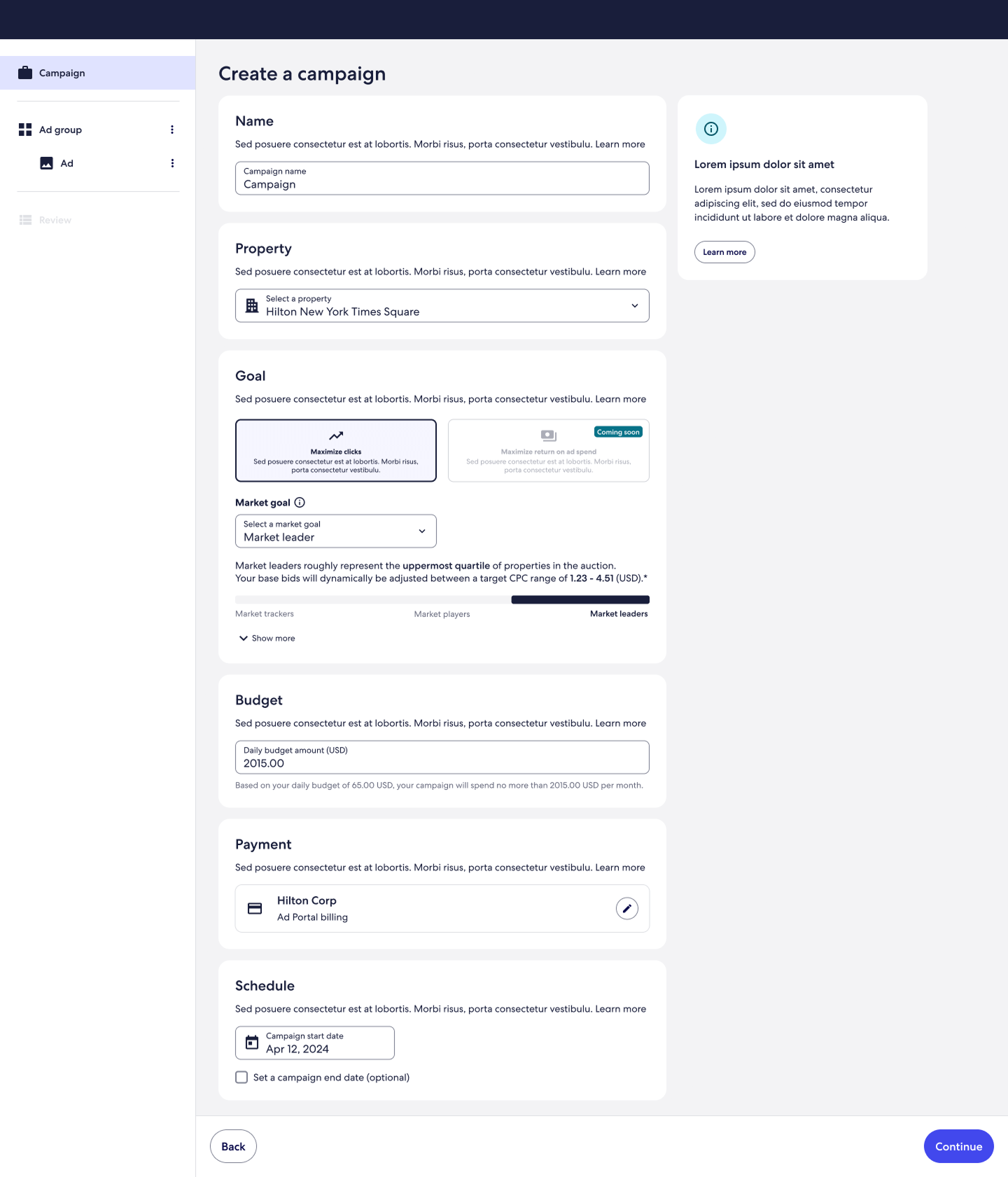
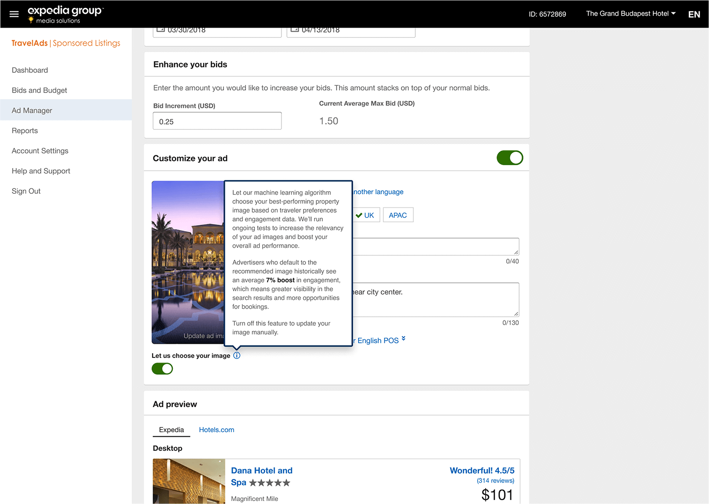
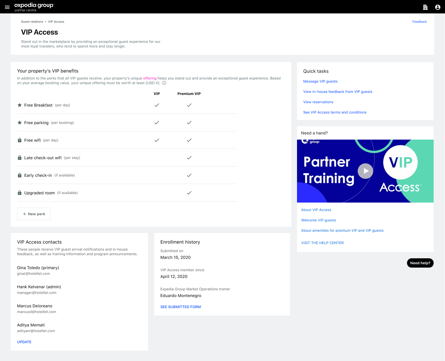
Our advertising solution had limitations—advertisers could only run one campaign at a time, requiring manual adjustments. Many turned to third-party tools, bypassing our platform. As Expedia's fastest-growing business, leadership saw an opportunity to expand advertising into a broader ecosystem alongside supply partner tools. However, advertisers had to create new accounts each time they accessed our solution, limiting adoption.
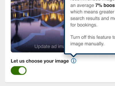
While working on the strategic ecosystem initiative (Ads Portal), we delivered tactical improvements to drive growth: Bid automation powered by machine learning. GenAI-driven description and title generation for rapid ad testing. ML-powered image selection using A/B testing to maximize conversions.
Solution
I co-created the product vision and strategy with stakeholders and leadership. We introduced a shared identity system, eliminating the need for separate accounts and enabling seamless access across tools. The auction model was redesigned to support multiple campaigns, allowing comparisons of media formats and languages. Onboarding was simplified, cutting interaction steps by ~60%.
Validation
Results were immediate: Simplified onboarding brought in 260 new advertisers within a month. Bid automation increased revenue by ~$5‐6M and improved ROAS. ML-driven image selection boosted conversions, adding ~$17M in revenue. GenAI tools were adopted by over 50% of partners on day one.
In January 2025, we launched the Ads Portal ecosystem to the first cohort, completing a complex migration within a year. This project transformed Expedia's advertising capabilities becoming one of four primary focus areas.
-
Discovery
The goal was clear: turn travelers into content creators and brand advocates, unlocking growth for Expedia's $640M Affiliates Program. I began by aligning with stakeholders to define objectives and conducted generative research to understand the pain points of both travelers and partners. Analyzing existing data and consulting domain experts, I identified opportunities to expand the program while assessing risks, particularly around integrating affiliate tools directly into traveler portals. This phase laid the groundwork for a strategy that balanced innovation with practicality.
Solution
With a clear vision, I led cross-functional workshops to explore solutions. The focus was on redesigning the Affiliate Portal to simplify onboarding and embedding affiliate tools seamlessly into the traveler experience. This approach ensured tools were available exactly when users needed them, enhancing engagement without disrupting their journey. I worked closely with leadership to refine the go-to-market plan, ensuring alignment and buy-in across the organization. Evaluative research helped validate the approach, confirming its potential to scale.
Validation
The redesigned Affiliate portal launched successfully, onboarding ~600 partners within six months and surpassing all growth targets. A/B testing validated the effectiveness of embedded tools, showing they not only improved the traveler experience but also drove higher engagement. Behind the scenes, a robust tech architecture was built to support the program's rapid growth, ensuring long-term scalability. This project demonstrated my ability to blend product leadership, business strategy, and customer-centric innovation to deliver measurable results.
-
Loyalty program
Travel Loyalty E-commerce Growth Marketing Strategy B2B2COctober 1, 2023 | Expedia Learn more
Discovery
Expedia's loyalty program was fragmented across multiple brands, creating a complex and disjointed experience for customers. I co-led the effort to redefine this program, aiming to consolidate offerings into a single, customer-friendly experience. Early on, I spotted the need for ecosystem and service alignment across the organization, breaking through silos to ensure a cohesive strategy. My team embedded deeply to understand the potential impact on both travelers and suppliers, conducting extensive research and aligning with stakeholders from marketing, sales, account management, legal, and analytics. This groundwork revealed an opportunity to start with pricing and cashback benefits, laying the foundation for a phased rollout.
Solution
The first phase focused on integrating pricing and cashback benefits for travelers and suppliers. I spearheaded the strategy, crafting executive pitches and gathering cross-functional feedback to refine the approach. We devised a step-by-step plan, starting with bundling traveler benefits like member discounts and cashback, with plans to expand to VIP perks later. On the traveler side, I led a fast-tracked project to ensure visibility of these benefits without compromising existing business metrics. This required careful balancing—delivering value quickly while maintaining performance across the board.
Validation
The launch exceeded expectations. The unified loyalty program drove a 40% revenue increase, adding $205M in value, while member-discount adoption rose by 12%. On the traveler side, retention grew by 7%, and all critical business metrics remained unaffected. This success validated the strategy of starting small, aligning the ecosystem, and scaling thoughtfully. My ability to navigate organizational complexity, lead cross-functional teams, and deliver customer-centric solutions was key to this outcome.
-
Analytics and coaching
Travel Data AI/ML Finance Strategy Mobile B2B B2B2CApril 1, 2022 | Expedia Learn more
Discovery
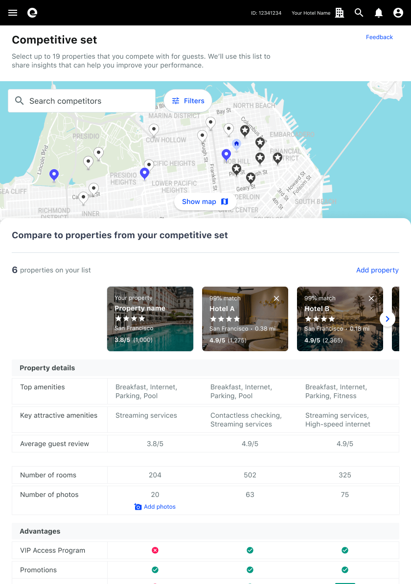
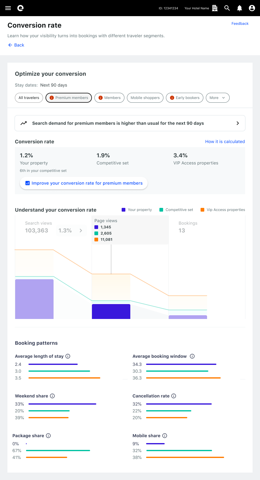
Our analytics tools had become overly complex, sprawling across 20 different pages developed tactically over the years. Despite Expedia's data being a significant competitive advantage, we received consistent feedback about a subpar user experience. To secure investment, we needed a product strategy with a clear attribution model.
Solution
We developed a data storytelling model that introduced problems through data visualizations and offered partners actionable steps to address identified market gaps. This approach transformed the experience into a virtual coach, assisting partners in setting and achieving goals. Our machine learning engine provided personalized data insights and proof points, tailoring actions to each partner's needs.
Validation
Our proof of concept achieved a record 14% conversion throughout the partner journey, convincing leadership of our approach. We then built a scalable solution focusing on omnichannel coaching through account representatives, marketing activities, and self-serve experiences. Over time, we streamlined and replaced older experiences, eventually positioning the coaching feature prominently on the product's homepage. This initiative resulted in $120M in revenue in the first year and a 10.2% market penetration.
-
Discovery
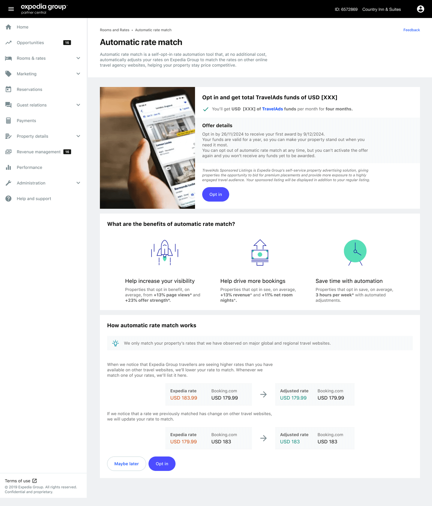
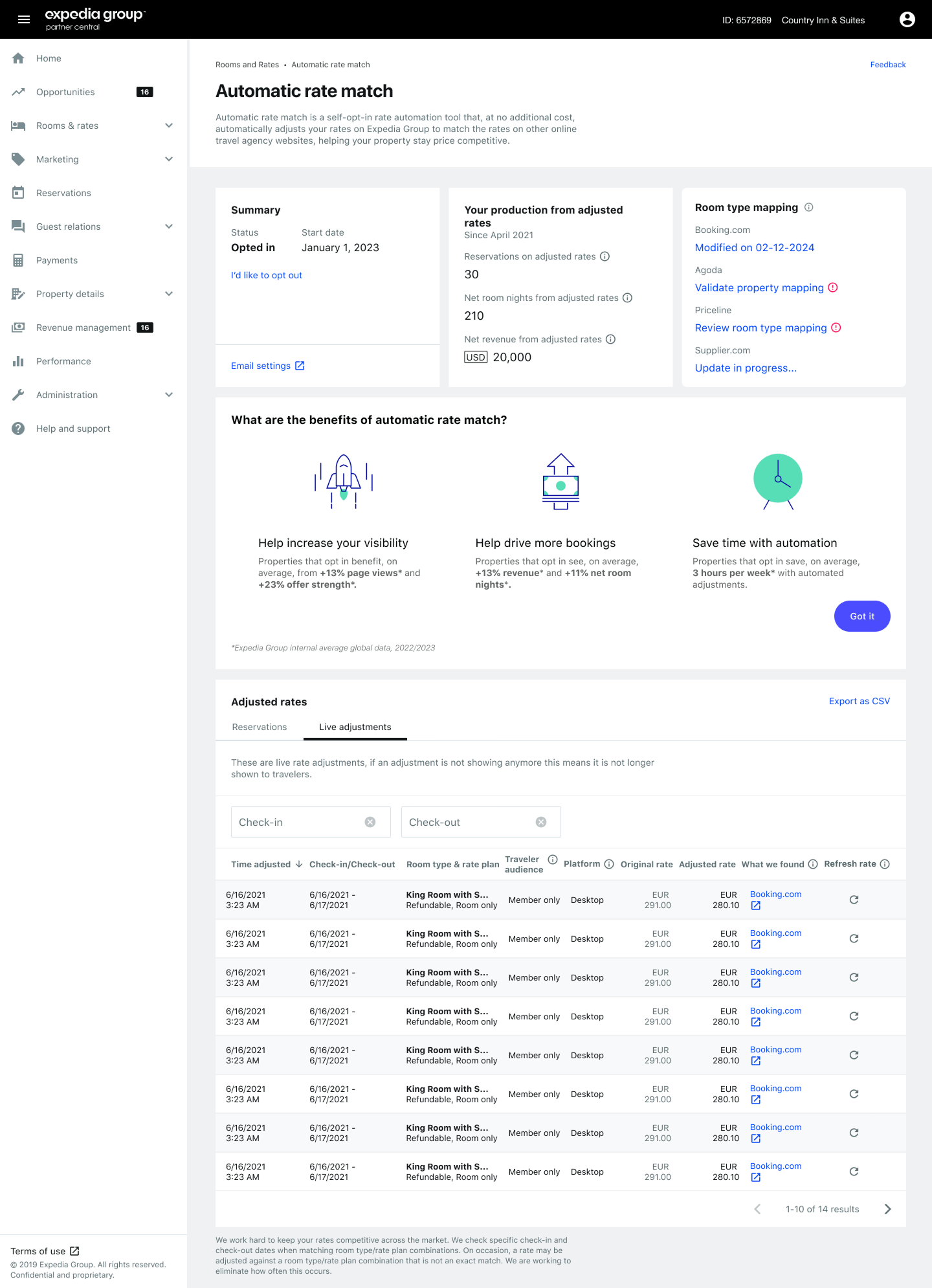
To remain competitive with platforms like Booking.com, Airbnb, and meta-search engines such as Agoda, Expedia needed to match or beat competitors' prices. A dedicated Business Intelligence team was already adjusting prices in the background, but these manual interventions were eroding profit margins. The onset of COVID-19 further complicated matters, necessitating swift action to support partners fairly during uncertain times.
Solution
We introduced a strategic initiative inviting partners to adopt pricing automation. This approach transparently adjusted prices to align with competitors, and in return, partners received substantial marketing credits—such as boosted visibility in search results and advertising support—during the pandemic. This not only alleviated the financial burden on Expedia but also provided partners with valuable support when they needed it most.
Validation
Initially, partners were skeptical of automated pricing adjustments, perceiving them as negative interventions. Recognizing this, we enhanced the experience by improving transparency and communication, illustrating how price automation led to higher conversions—averaging a 14% increase. These refinements improved partner satisfaction and trust. Subsequently, pricing automation was integrated into our Coaching program, accelerating its adoption. This initiative evolved into a USD1.2B program, contributing to a substantial increase in revenue and becoming a central focus within our Geneva office, where the data science team expanded to approximately 120 members.
-
Discovery
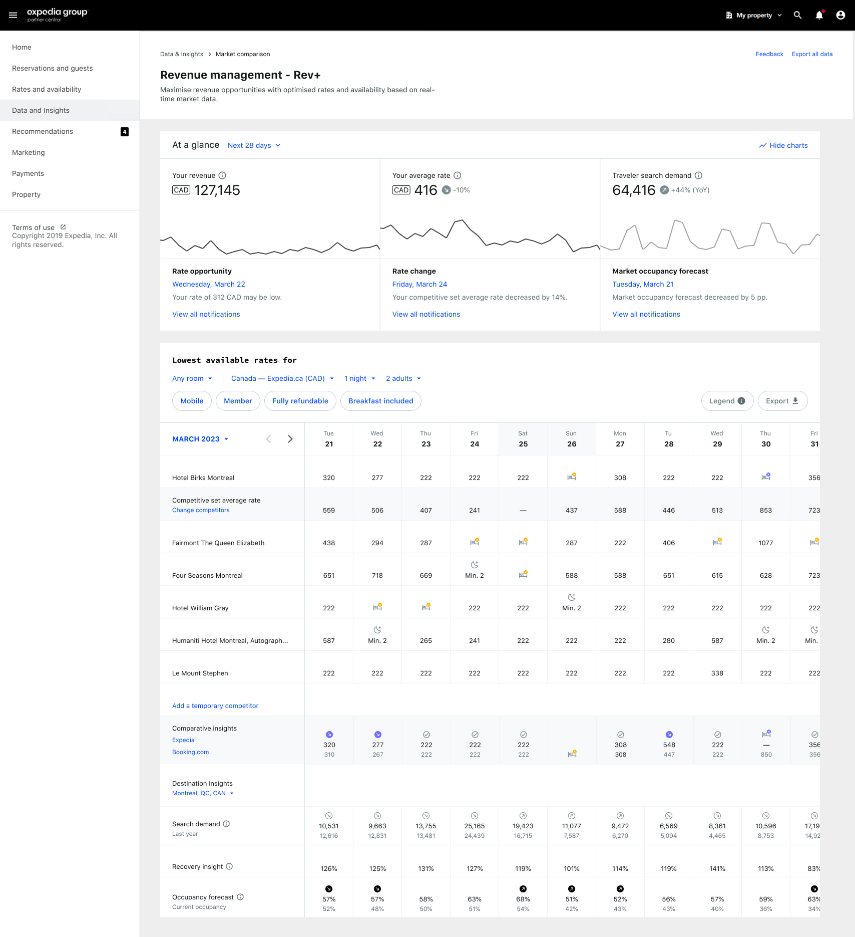
Our free revenue management tool allowed supply partners, be it small vacation rentals or large hotel chains, to monitor competitors' pricing and adjust accordingly. However, engagement was declining due to the strong competitive advantage of paid tools. The platform was built on an outdated stack, leading to a bloated user experience. Partners expressed frustration, yet those who used it reported a 12% revenue uplift.
Solution
Deciding to simplify the experience, we removed underused features, even at the risk of some revenue loss. The new platform offered real-time competitive insights akin to financial services. Within a year, most users voluntarily switched to the new experience and utilized market occupancy forecasts from our data science team. Our machine learning engine provided pricing adjustment recommendations with a 20% pitch-to-act conversion, marking a clear commercial success.
Validation
We released the MVP alongside existing systems to track adoption and optimize feature readiness. Conducting iterative testing and behavioral analysis, we improved ML-driven recommendations. Establishing a framework for ongoing optimization, we unlocked future product growth opportunities. This initiative resulted in a 25% increase in monthly active users and a 7% boost in partner revenue. Additionally, we renamed the product based on user feedback, resulting in an additional 17% engagement.
-
Discovery
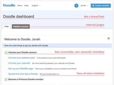
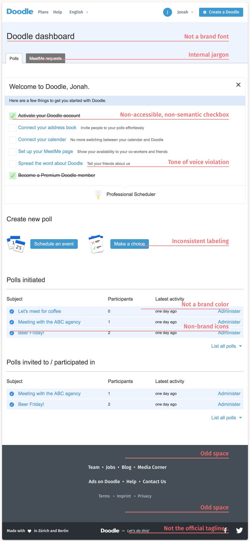
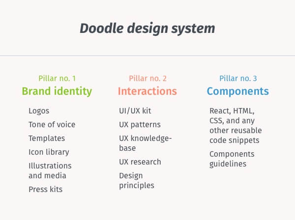
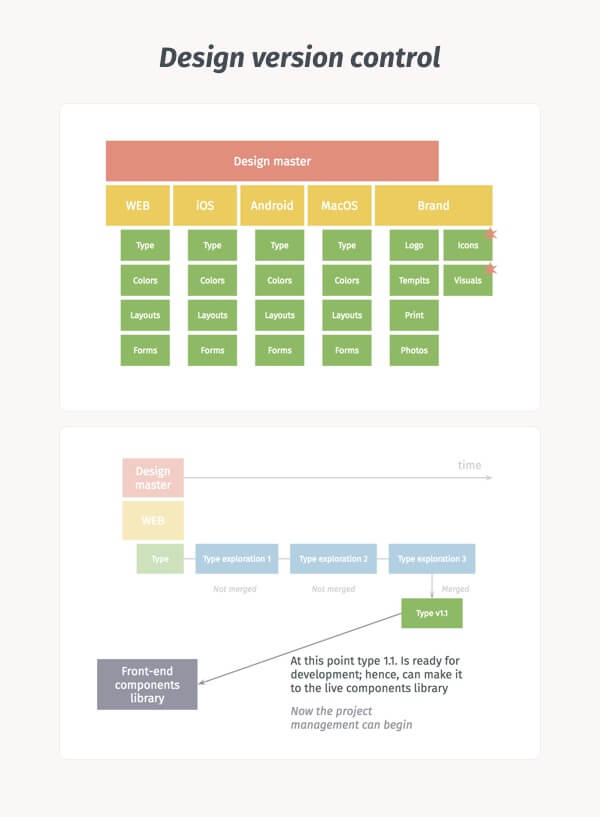
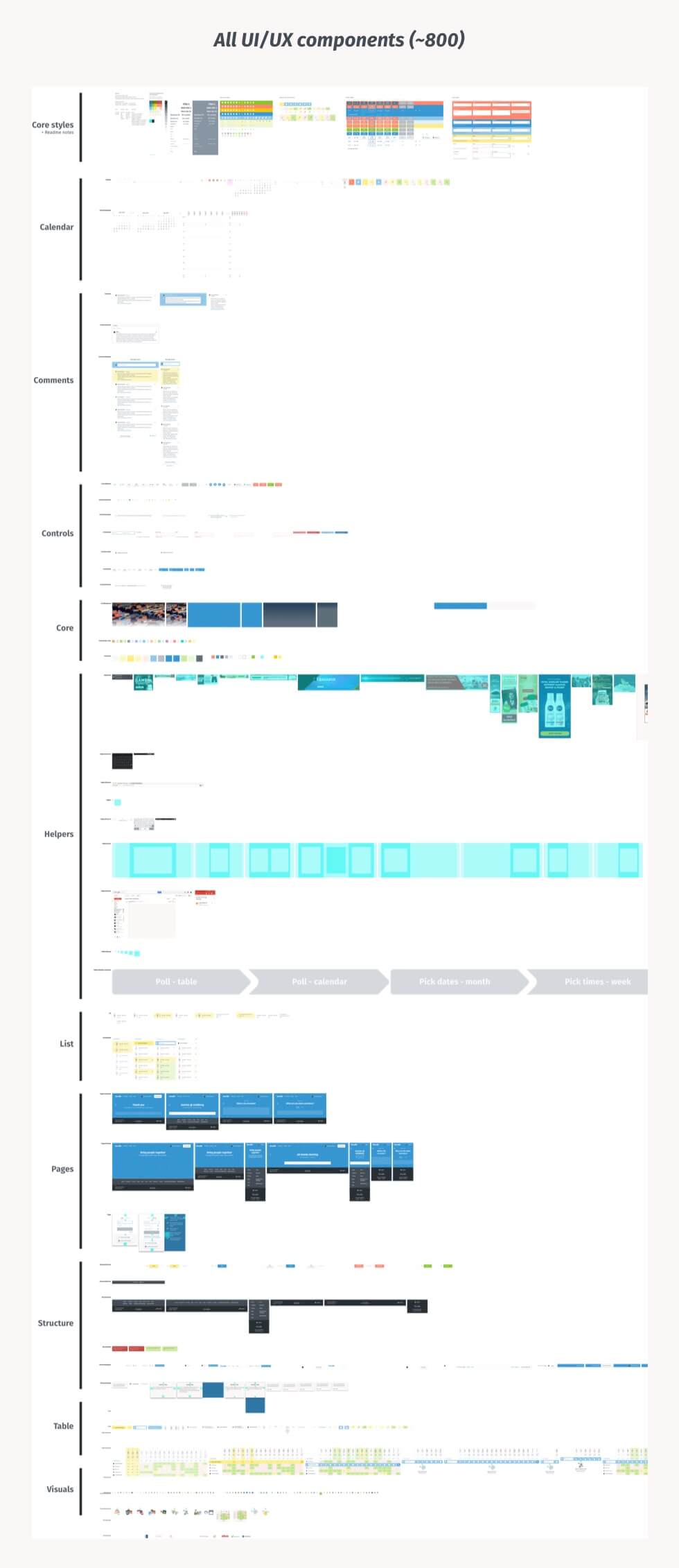
Doodle's design system was struggling with significant design debt, including inconsistent interactions, visual elements, and a lack of brand identity and coherent UX copywriting. These issues were particularly evident in the development process, where numerous one-off solutions were introduced daily.
Solution
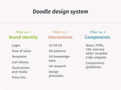
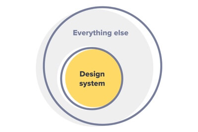
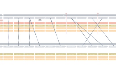
I created the Doodle Design System (DDS), a unified set of tools for the entire organization. DDS is based on three pillars: brand assets, interaction patterns and principles, and front-end components. This system enables designers and non-designers to make confident decisions when building products, ensuring consistency in interaction and accessibility.
DDS increased confidence across the production team, leading to less focus on spec talk and more on UX talk. The most challenging aspect was agreeing on changes to be implemented in the front-end. Establishing design principles early in the process made this easier.
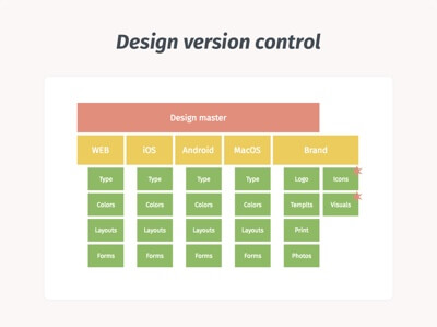
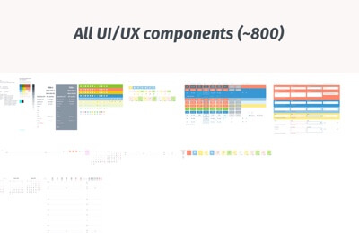
I established a version controlled components kit, broken down into separate libraries (Core, Forms, Layouts). With this system in place, we built a process to support both innovation and optimization design workflows.
-
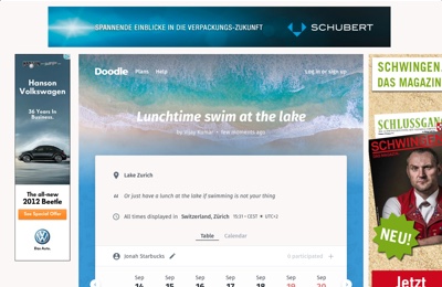
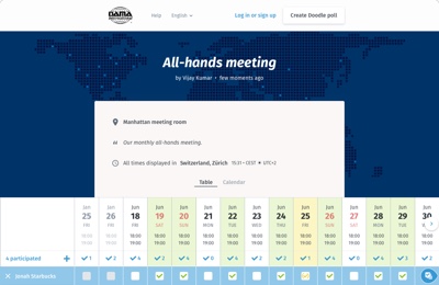
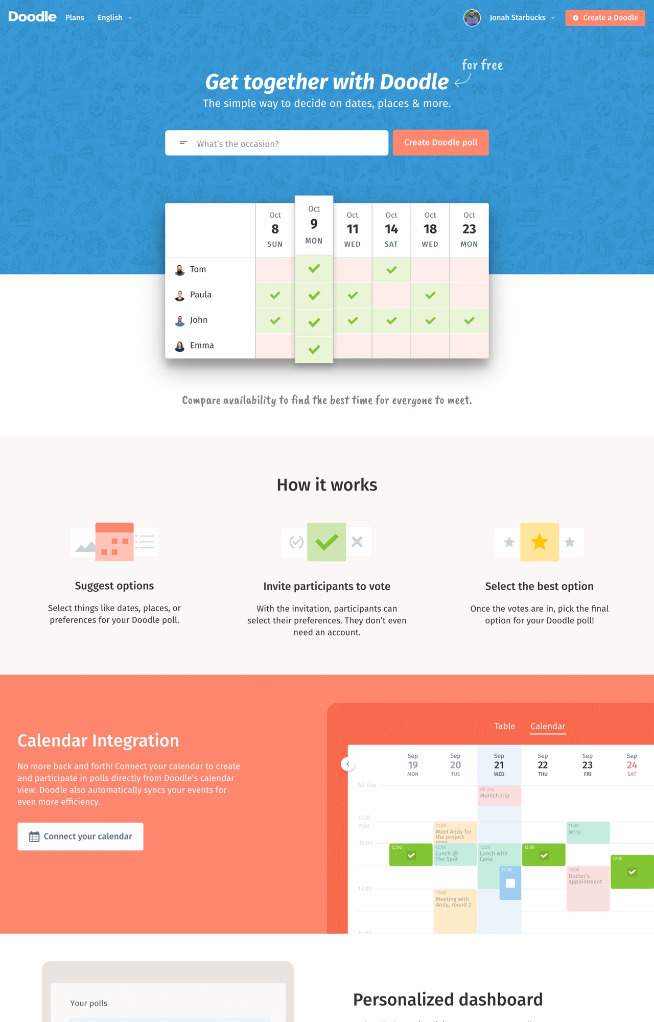
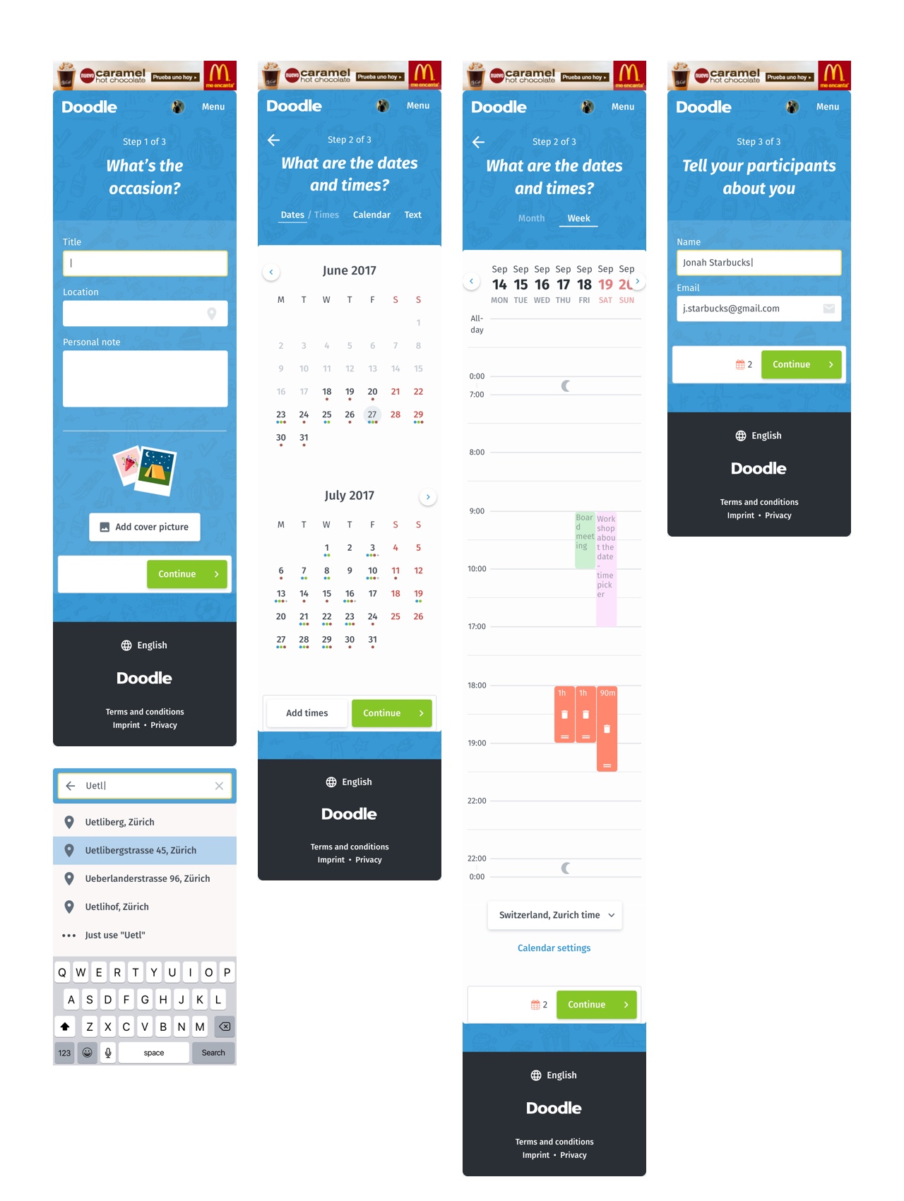
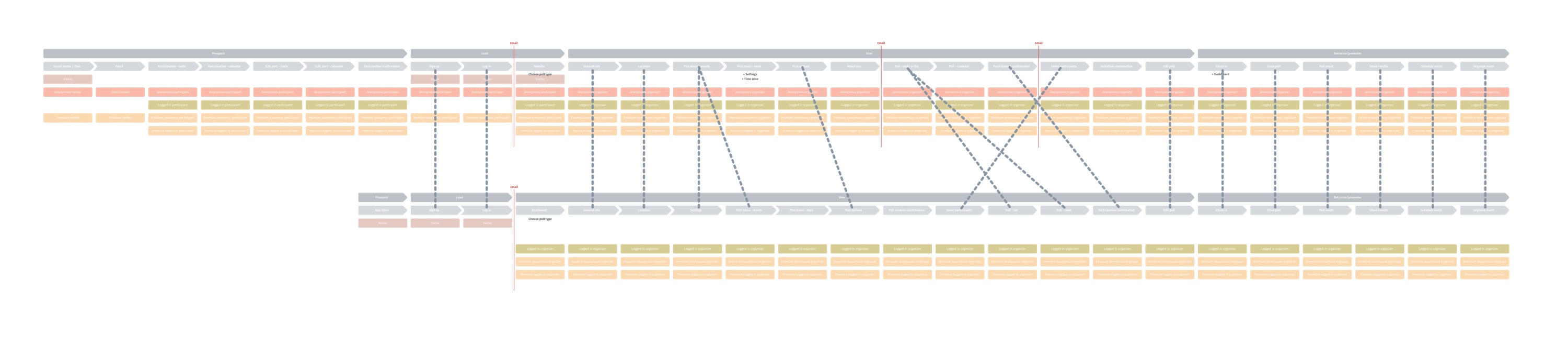
Doodle: Group scheduling redesign
Craft Advertising Marketing B2C Strategy Mobile LoyaltySeptember 1, 2017 | Doodle Learn more
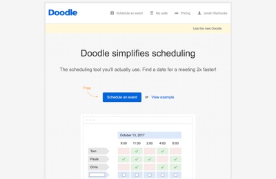 Old Doodle homepage
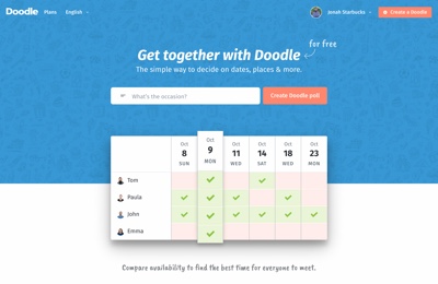 Redesigned Doodle homepage
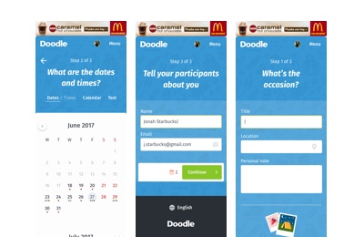 Mobile version of the poll setup
 Redesigned user journey map
 Redesigned calendar view
 Redesigned white-label Doodle
Discovery
I joined Doodle to assist with a product redesign that had been in progress for a year. I needed to understand the history of design decisions and adapt quickly to avoid slowing down the redesign process. Additionally, the mobile experience had not been considered, which posed a risk to Doodle's renowned UX status. I had to develop a plan to address these issues.
Solution
I conducted extensive exploration, documentation reviews, user research, and tech support shifts to identify main user friction points. Small changes with significant impact led to quick wins, allowing me to focus on a broader design strategy.
I opted for a gradual improvement approach rather than a revolutionary one. This strategy resulted in more confident design decisions, as each was backed by user research or data analysis. My most impactful designs included the responsive "Doodle table"—a notoriously complex interface element—and a calendar view.
Doodle experienced 15-20% growth after the global launch of my co-authored redesign, peaking at approximately 25 million monthly active users. User reviews improved by about 14% over three months, and desktop conversion rates increased by 8%, while mobile conversions rose by nearly 30%.
-
 Blog page wireframe (viewport of 1920px)
 Blog page wireframe (viewport of 320px)
 Homepage (viewport of 1920px)
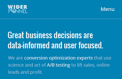 Homepage (viewport of 480px)
 Experts (viewport of 1920px)
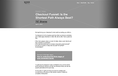
Discovery
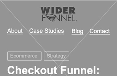
WiderFunnel's (now conversion.com) website, last redesigned in 2008, had become outdated and was hindered by a clunky infrastructure that prevented easy editing of content and visuals.
Problems were not just technical; my task was to create website that is data-driven as a proof of concept with well organized and editable content allowing simple optimization tweaks in the future at the the same time.
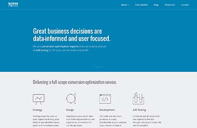
Solution
I adopted Brad Frost's atomic design approach to address these issues. This method involved creating an information architecture based on modular components that could be easily shifted or reused. I conducted qualitative research, including benchmark tests and open card sorts, to inform the design decisions.
The redesign led to a more flexible and user-friendly website. A content audit resulted in the removal of over 70% of the pages, significantly improving site exploration and user engagement.
The new design, even in its barebone state, outperformed the original website, setting a strong foundation for future enhancements.
-
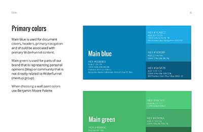
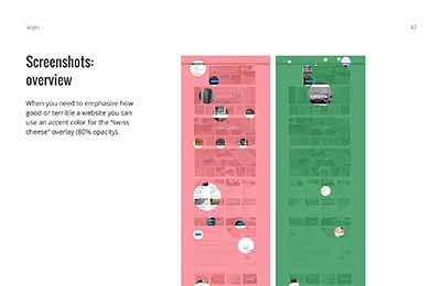
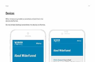
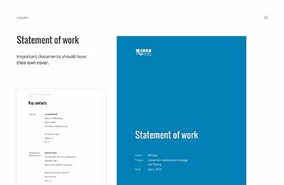
Discovery
WiderFunnel lacked consistency in its brand communication, which spanned print materials, digital campaigns, tone of voice, and messaging. The need for a brand guide was evident to address specific challenges, such as presenting A/B test variations and results, and process-related questions.
Solution
The initial outline and layout of the brand guide were developed by a senior designer under the marketing director's guidance. I joined the project as the art director and later took over the creation of the guidelines themselves.
The resulting brand guide is a comprehensive 90-page document that beautifully presents the design system, tailored for better understanding and showcasing of conversion rate optimization processes and A/B test results.
-
Discovery
With two new designers joining our team, I quickly realized there was a need to address new responsibilities and challenges. The existing design process did not scale well, requiring attention to improve efficiency and integration.
Solution
I refined the hiring process for designers by defining the necessary skills and creating a structured interview process. For onboarding new hires, I developed a program that covered the current state of design within the company, file organization, time tracking, and tips for efficient tool use.
Additionally, I streamlined the design workflow by addressing frustrating aspects, such as exporting assets from Photoshop and establishing naming conventions, which reduced the time spent on these tasks.
These improvements led to a more efficient and scalable design process, enabling the team to focus on creative and strategic tasks rather than administrative ones.
-
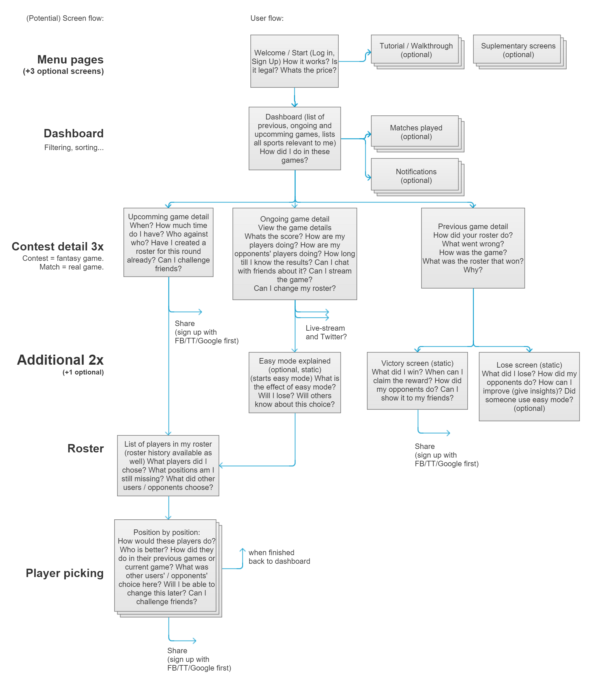
 This is a hybrid between screenflow and user journey. It's a tool that I use to simplify the way I think about information to be conveyed to users at that specific moment.
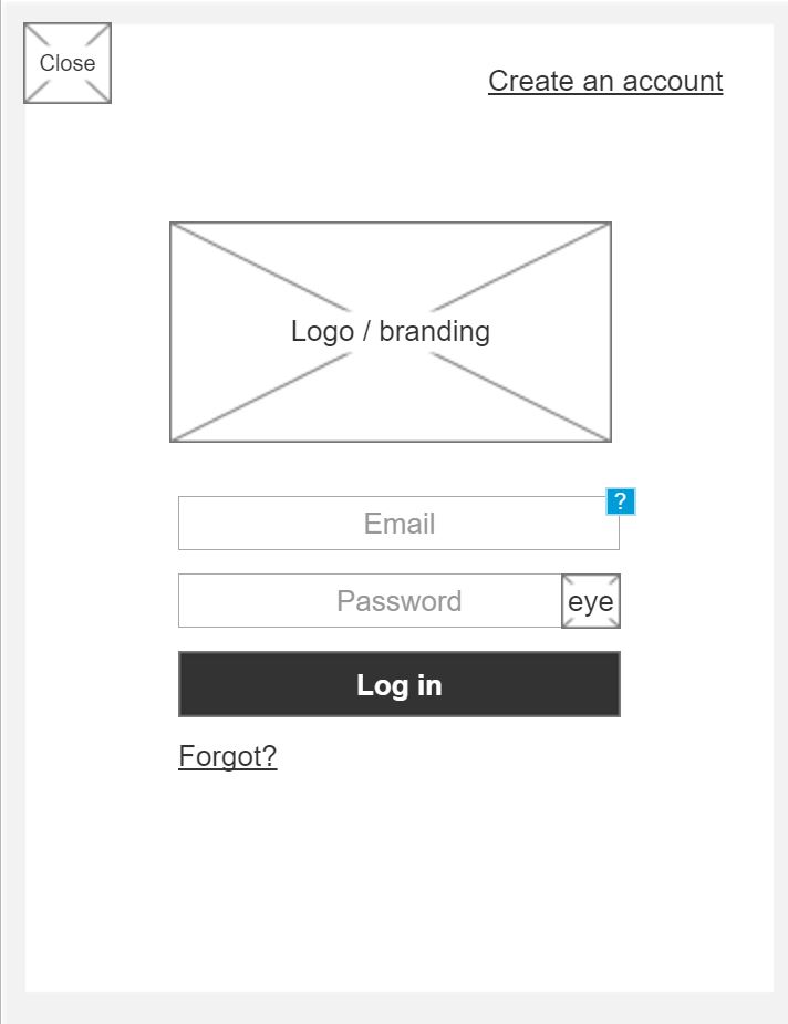
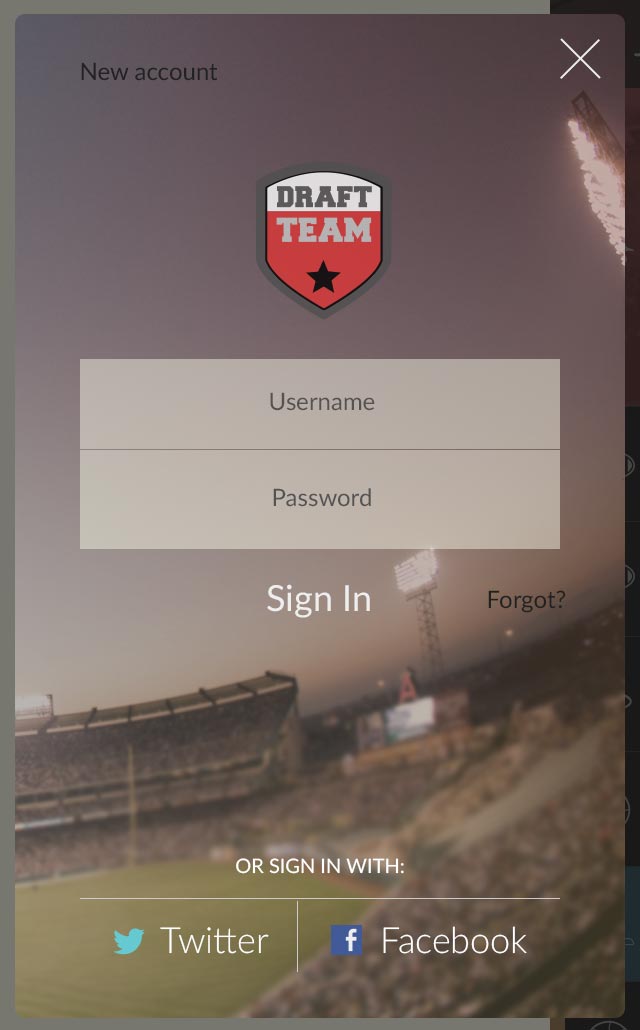
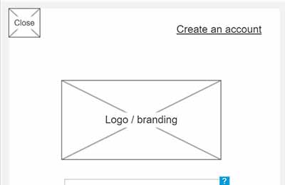 Log in / Sign up wireframe.
 Login in / Sign up mock-up.
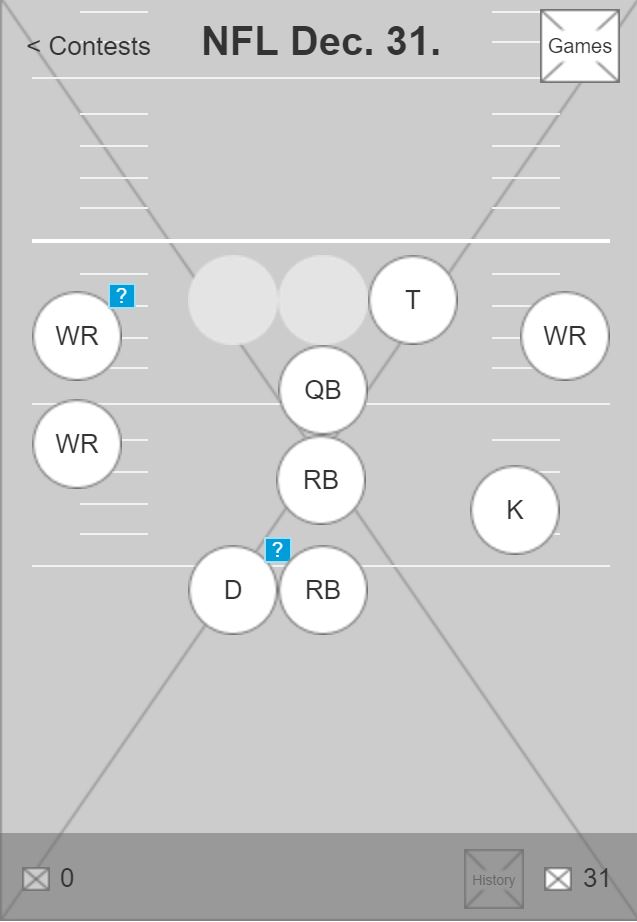
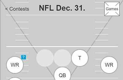 This is a screen where users draft their players for their respective positions. This is a great place for sport field metaphor.
 Football field mock-up with options to draft athletes.
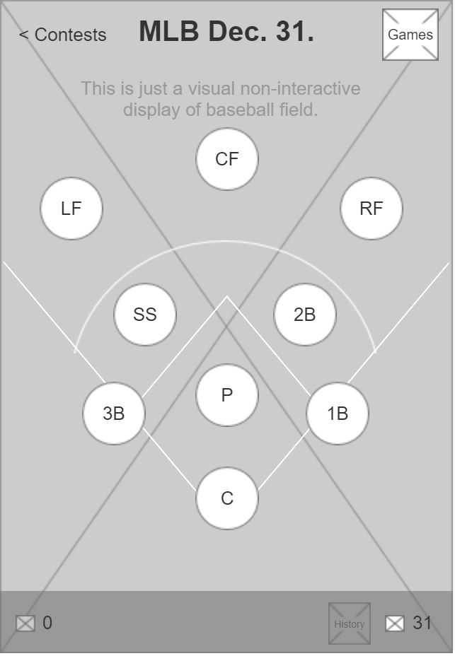
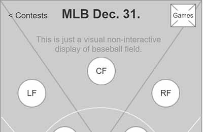 Same rules can be applied to any other sport. As seen for baseball on this wireframe.
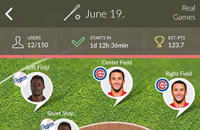 Baseball field mock-up with options to draft athletes.
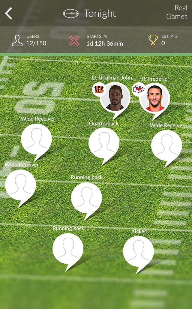
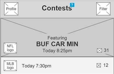 This is the 'home' screen wireframe - place where you can filter and pick a sport you are interested in.
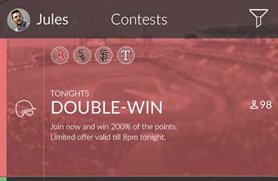 Mock-up allowed me make this part of the app a lot more desirable by addition of sport-related photos in the background and dinstinctive colour-coding.
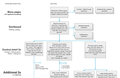
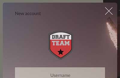
Discovery
Patternly approached me to design a game interface that clearly explains the concept of fantasy sports. The onboarding players had difficulty understanding the mechanics, and there was no time or budget for user research. I had to improvise to gather some insights.
Solution
I conducted competitive research and benchmark testing, which provided adequate insights to begin the ideation and sketching phase. A high-level information architecture was created to guide the development team on the structure, allowing them to start coding while I focused on more detailed interactions.
This is a screen where users draft their players for their respective positions. This is a great place for sport field metaphor.
Football field mock-up with options to draft athletes.
Same rules can be applied to any other sport. As seen for baseball on this wireframe.
Baseball field mock-up with options to draft athletes.
I developed a concept that utilized an axonometric presentation of the field for each sport, which effectively illustrated the metaphor of real games. This approach significantly boosted engagement. However, the project was put on hold after the funding company was acquired.
-
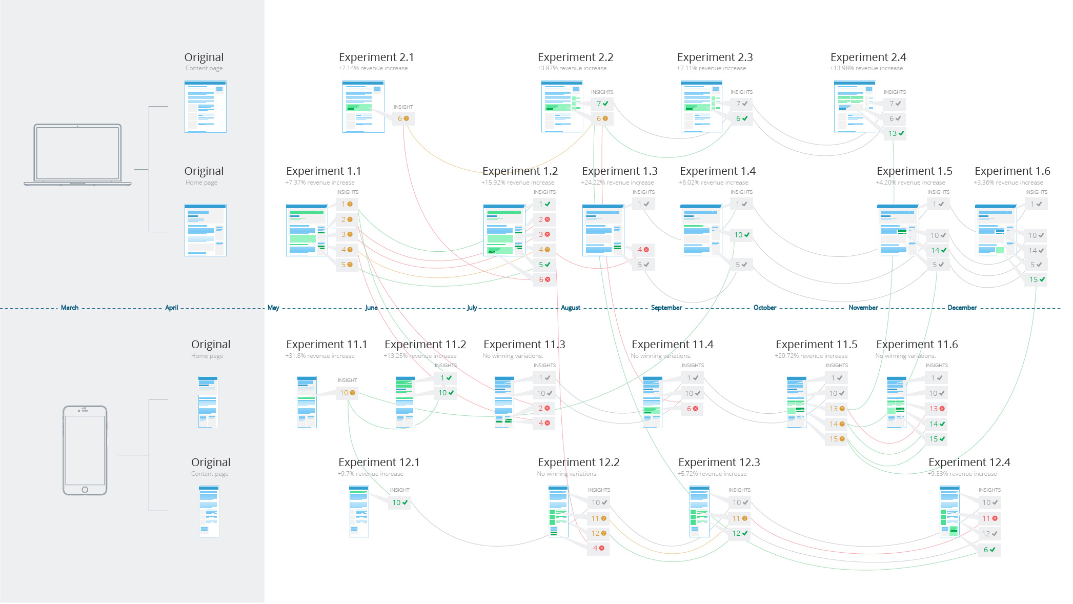
DMV.org, Magento: A/B testing
Finance E-commerce B2C A/B test Data Marketing SalesApril 15, 2014 | WiderFunnel Learn more
Discovery
DMV and Magento are notable clients for whom I was responsible for delivering user experiences. I collaborated closely with strategists who handled research, analysis, and hypothesis creation.
To get results from A/B test, you can't change a lot of things at the same time and as a designer you get easily frustrated by this "you can't touch this" approach. Yet focusing on results and learning what works and what doesn't motivated me to focus on divergent thinking.
Solution
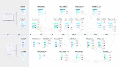
For DMV.org, the challenge was to test changes within a single insurance module. I pushed my design limits by creating hundreds of variations for this module in collaboration with account managers and design team. This effort resulted in an overall 282.2% revenue increase over two years.
For Magento, the approach was more flexible, allowing for significant changes on the homepage and radical adjustments on the landing pages. Later, the talented designers in my team took over the project under my guidance, continuing to drive impressive results.
The A/B testing initiatives for both clients led to substantial improvements in user experience and business metrics, demonstrating the power of iterative design and data-driven decision-making.
-
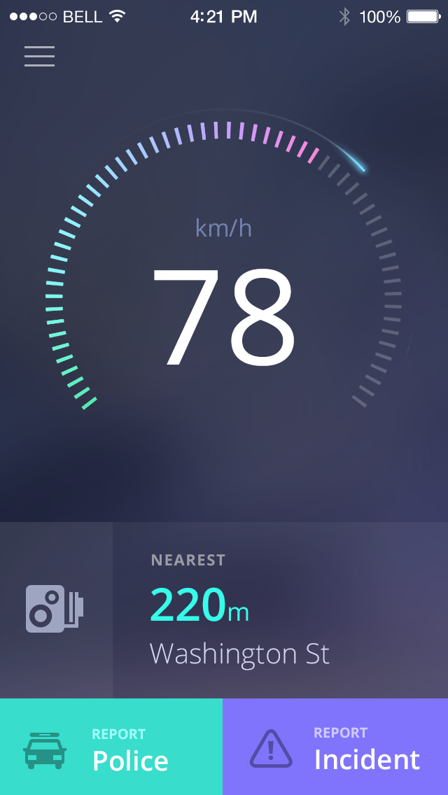
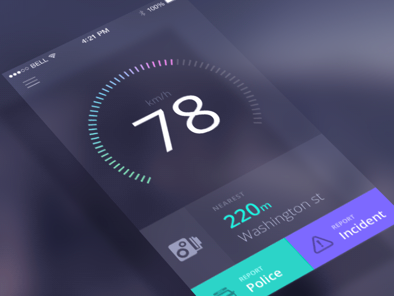
Discovery
The idea to create a standalone product that was part of our main GPS navigation allowed me to facilitate 'gamestorming' sessions with other designers. This initiative aimed to generate innovative product concepts and develop a clear problem specification. The goal was to create a product that is:
- 1. Easy to interact with while driving
- 2. Capable of collecting data to feed back into the main GPS navigation system
Solution
The initial version of the interface displayed the user's current speed, mimicking a physical dashboard speedometer, and allowed for reporting incidents and danger zones. The second version introduced a dashboard camera feature and travel logs. During a two-day company hackathon, we successfully ported the application to Windows Mobile, covering all three major mobile platforms with enhanced landscape layouts.
The final version featured a radar-like interface and reached 100,000 downloads within the first month, achieving a top 50 rank in 46 countries. The application was praised for its design:
"Sygic's Speedometer app is gorgeous, with minimalist, elegant styling and an uncluttered overall look, and it works well."
- Sarah J. Purewal, PC Revue -
Archiles: Bookkeeping made simple
Finance Strategy B2B Craft Highly-regulatedOctober 15, 2013 | SmartHill Learn more
 Company profile wireframe - here's where you set up your billing and your company info.
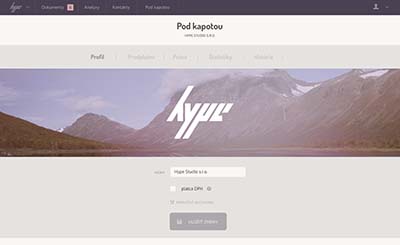 Company profile mock-up.
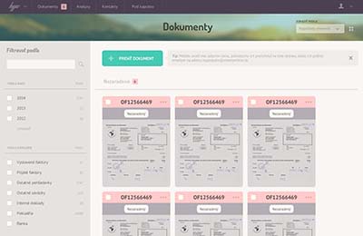
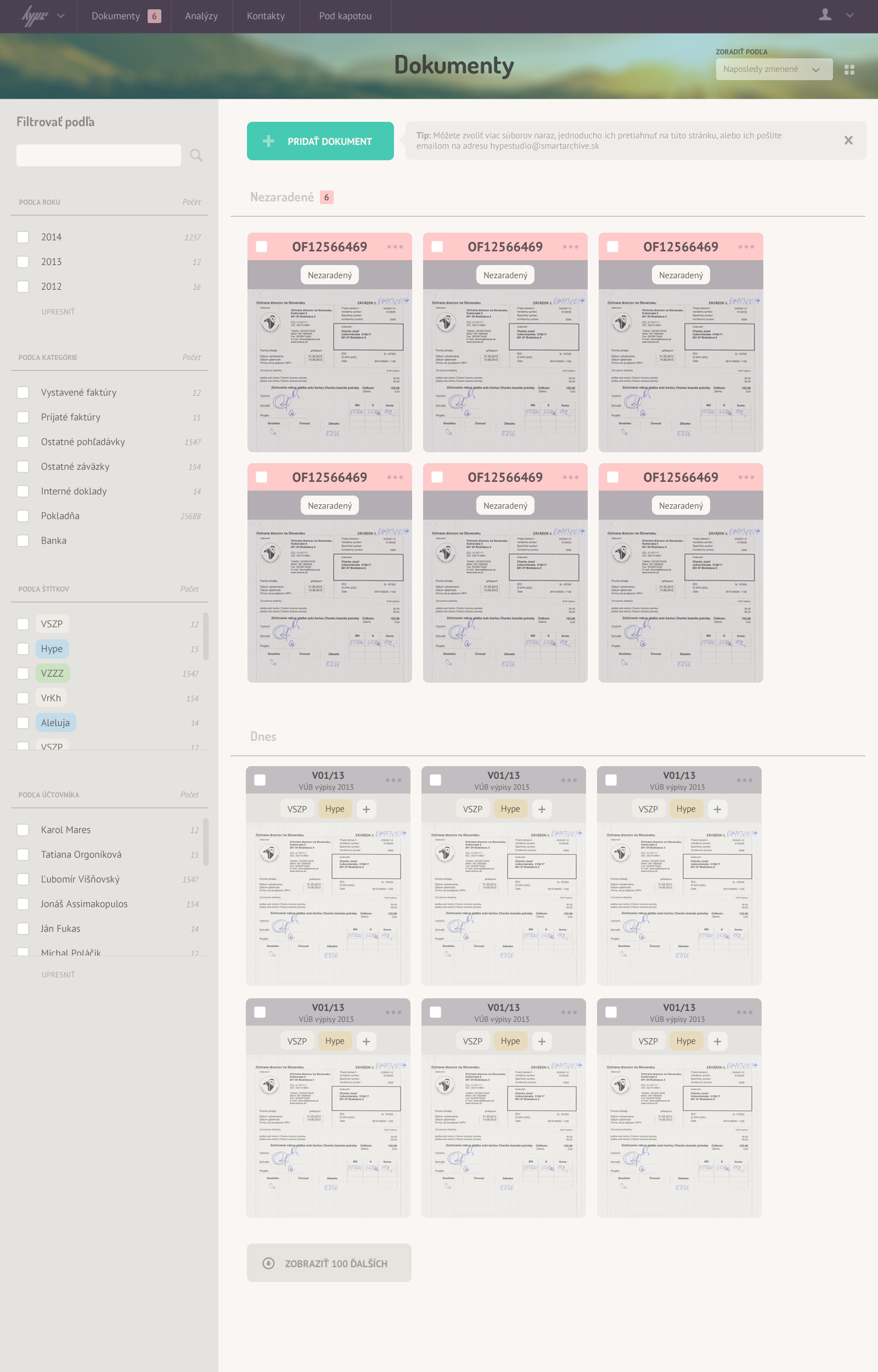
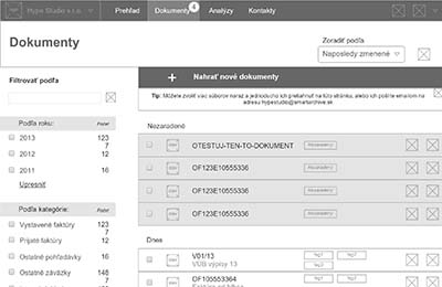 A list of documents mock-ups - the primary objective of the application shifted towards files management after insightful qualitative research.
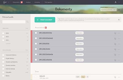 This list had to trigger a need to complete archiving process by inviting users to file details and bulk actions. This mock-up illustrates the latter.
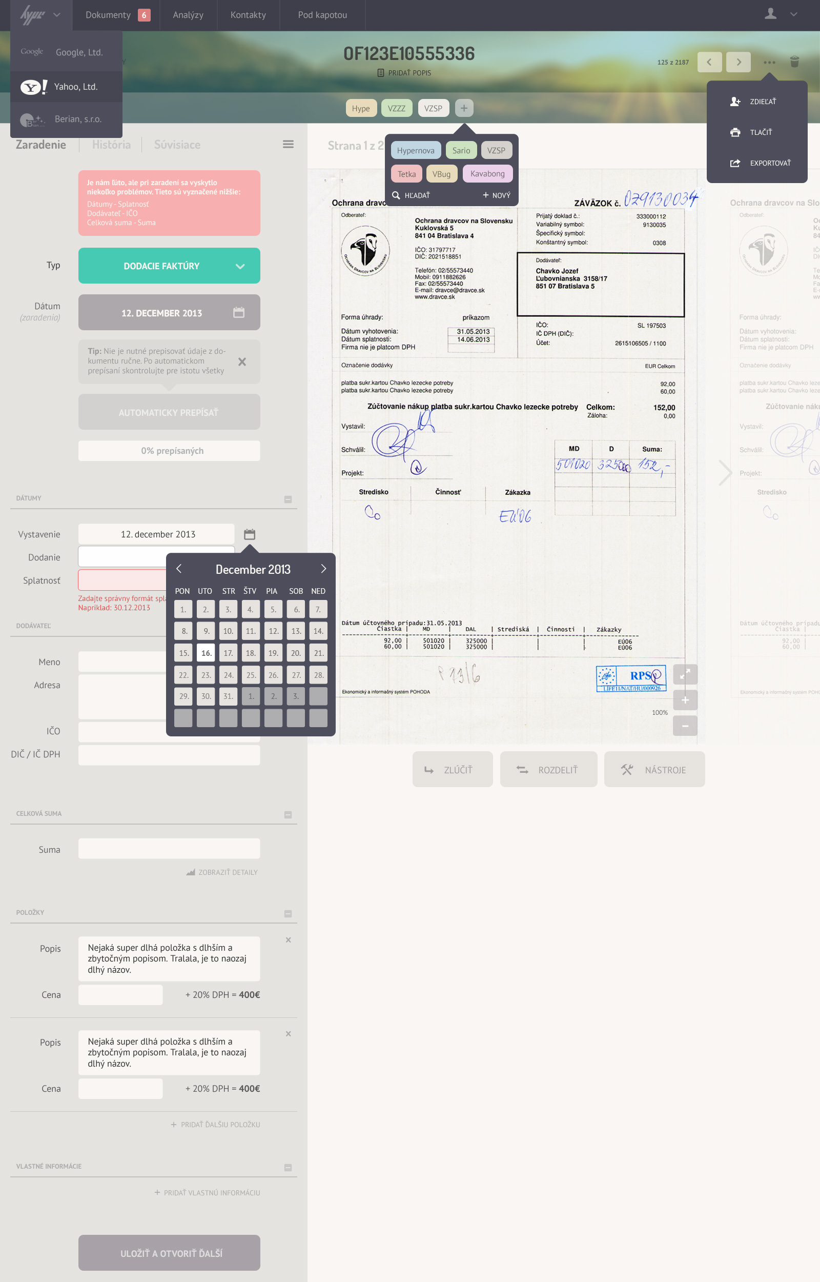
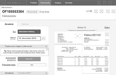 File detail wireframe. 'Digitalization' (conversion of paper document into digital one) takes place here. If something is wrong, users have control over the information extracted.
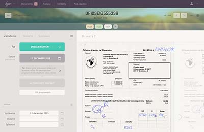 File detail mock-up. Clear indication what the first step should be.
 Grid view.
 Other selected parts of the UI illustrated.
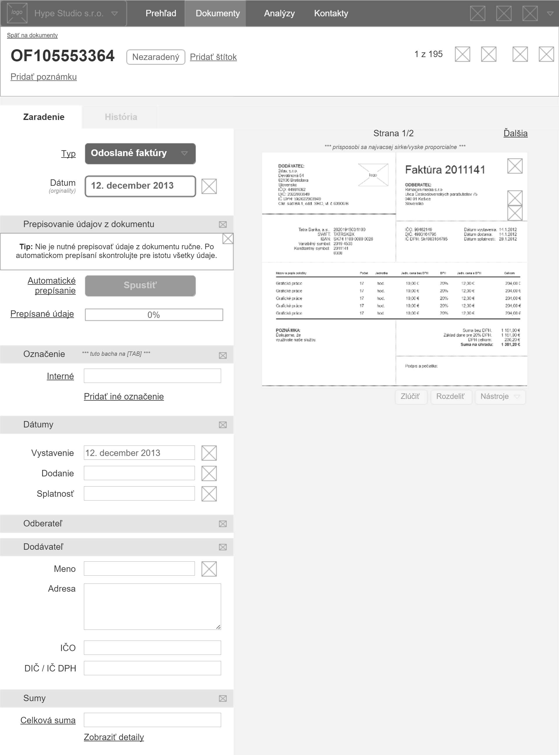
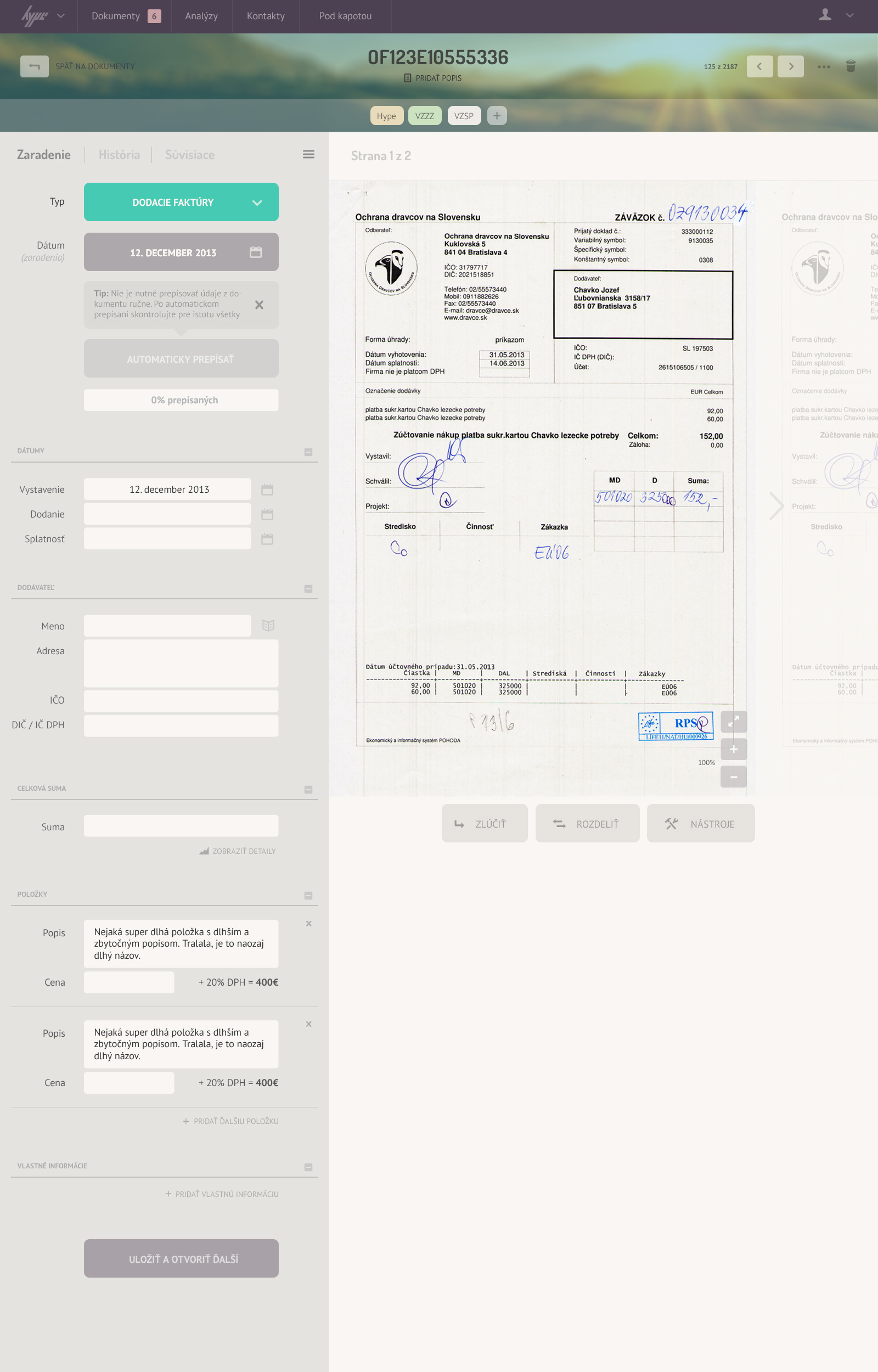
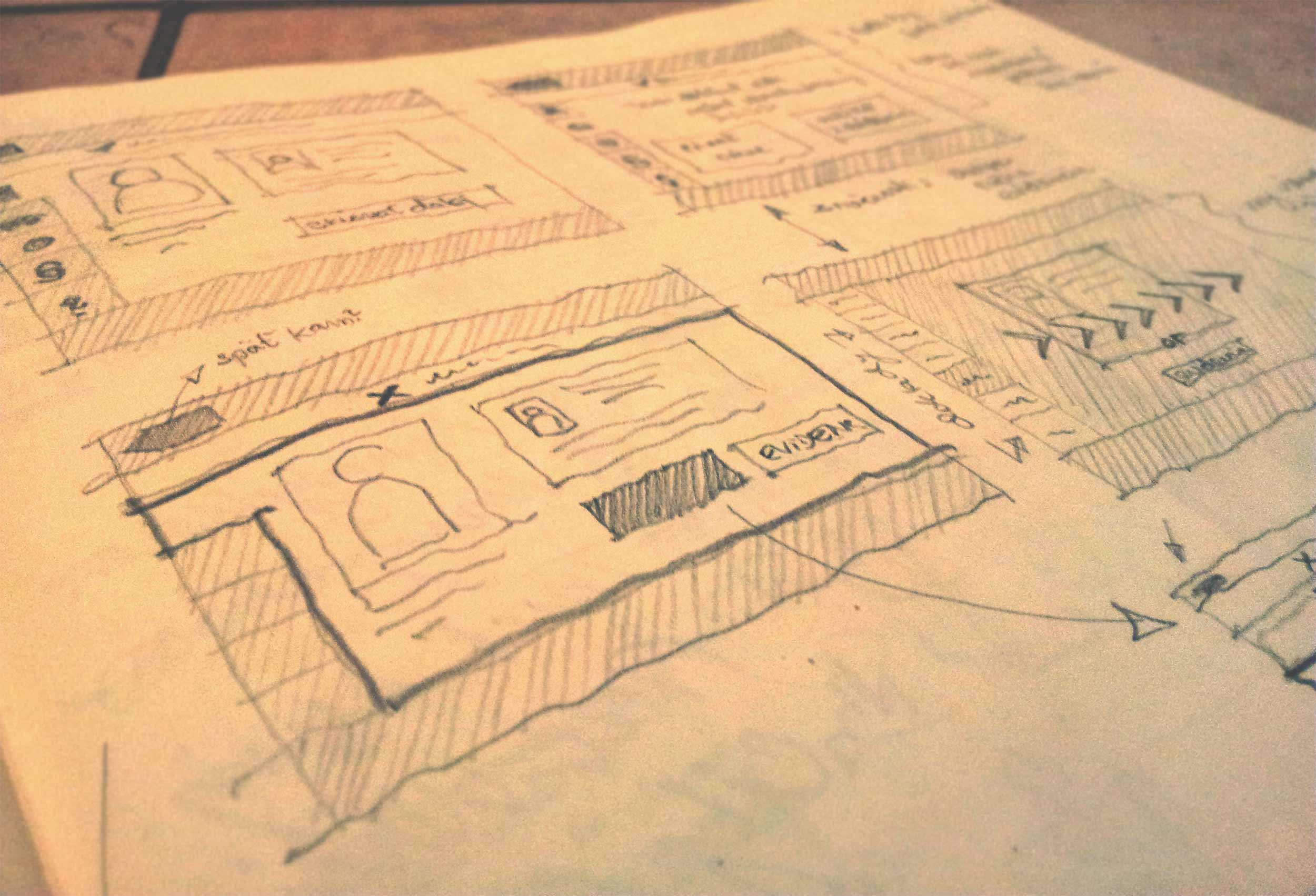
Discovery
Legislative developments in Slovakia motivated a small startup to create a product that simplifies the digitalization of receipts. I was asked to review the concept mockups and enhance the user experience to make the product more appealing and intuitive for bookkeepers.
Company profile wireframe - here's where you set up your billing and your company info.
Company profile mock-up.
I focused on improving the user interactions and visual design consistency while maintaining the core functionality. The redesign aimed to create a more delightful and efficient user experience, addressing the initial usability concerns.
Solution
A list of documents mock-ups - the primary objective of the application shifted towards files management after insightful qualitative research.
This list had to trigger a need to complete archiving process by inviting users to file details and bulk actions. This mock-up illustrates the latter.
Understanding accounting was a frustrating first step but a rewarding one.
Solution
Apart from becoming a rookie accountant, the project kicked off with series of stakeholder interviews and short taxonomy research. This translated into the first iteration of a prototype and qualitative research carried out by the team.
File detail wireframe. 'Digitalization' (conversion of paper document into digital one) takes place here. If something is wrong, users have control over the information extracted.
File detail mock-up. Clear indication what the first step should be.
We needed to get back to the drawing board and rethink the concept. The prototype we built was mainly focused on file management. And it worked!
We decided to approach it with an easy onboarding and carefully selected tone of communication - allowing first-time users to explore and build trust while allowing the advanced users to benefit from a streamlined use.
-
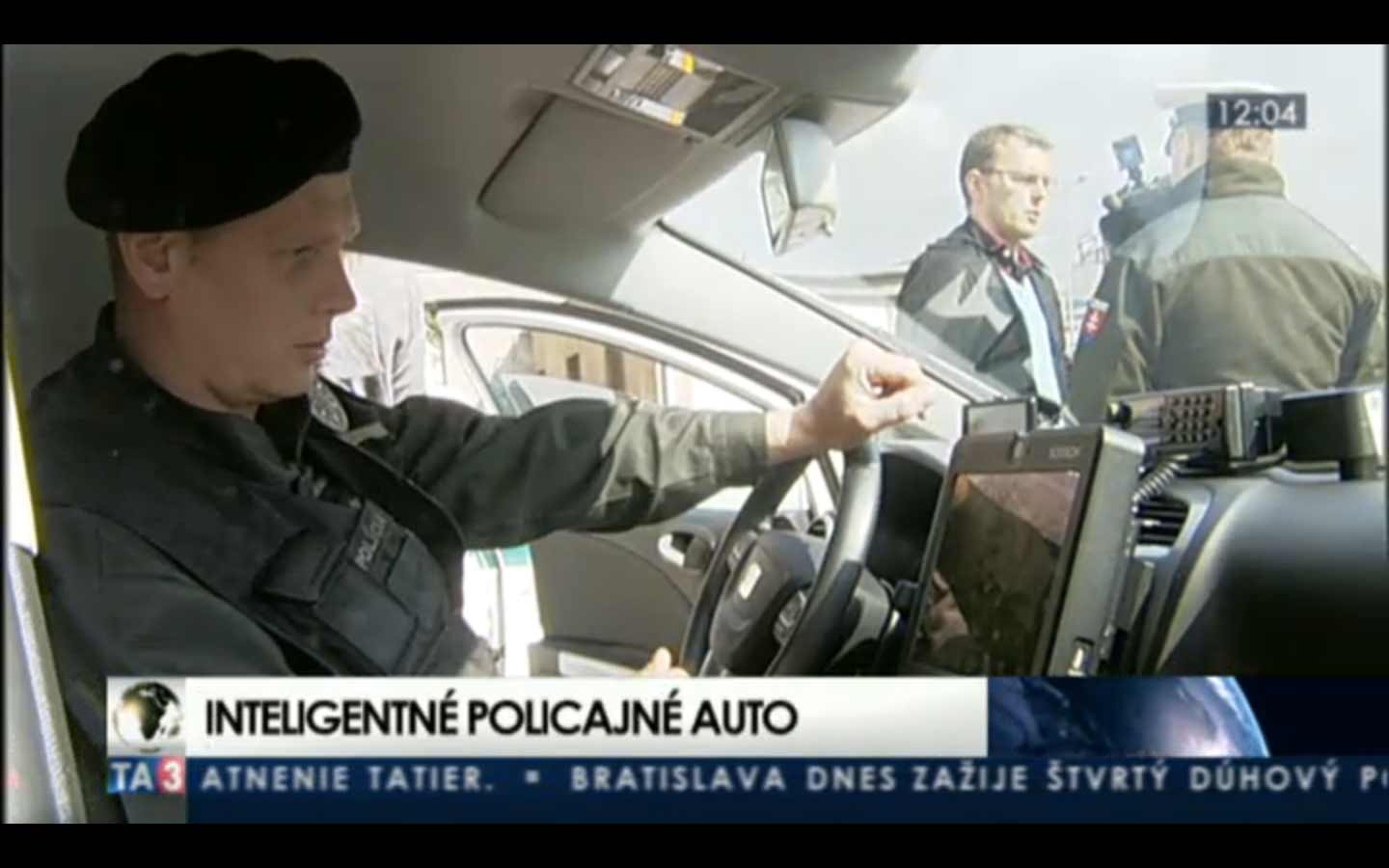
National car registry
E-gov Strategy B2B Craft Mobile HCI Highly-regulatedJune 1, 2013 | Ministry of Interior Affairs of SR Learn more
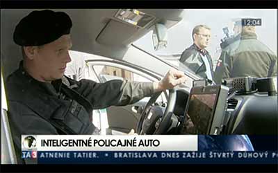
Discovery
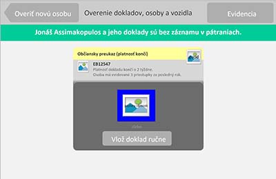
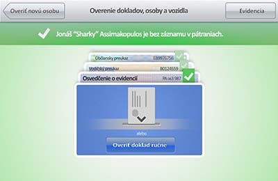
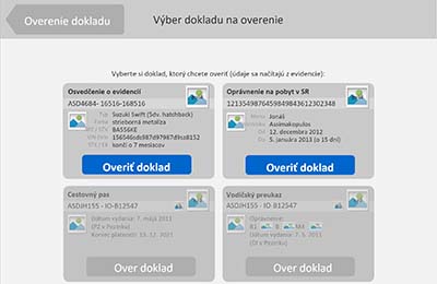
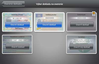
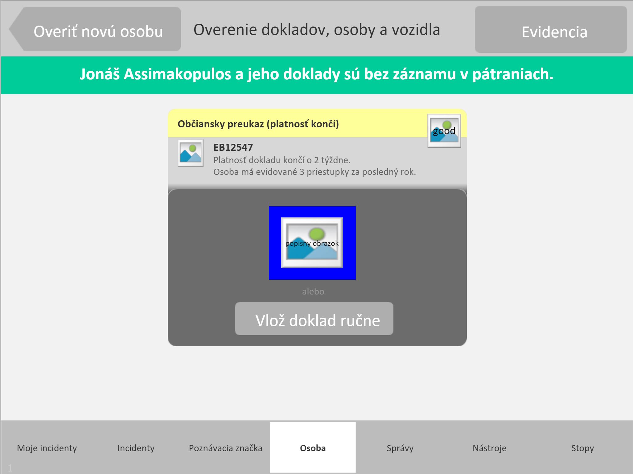
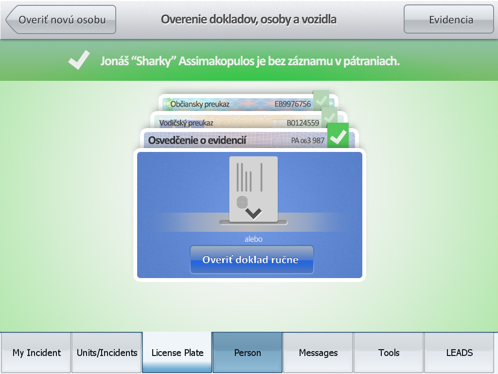
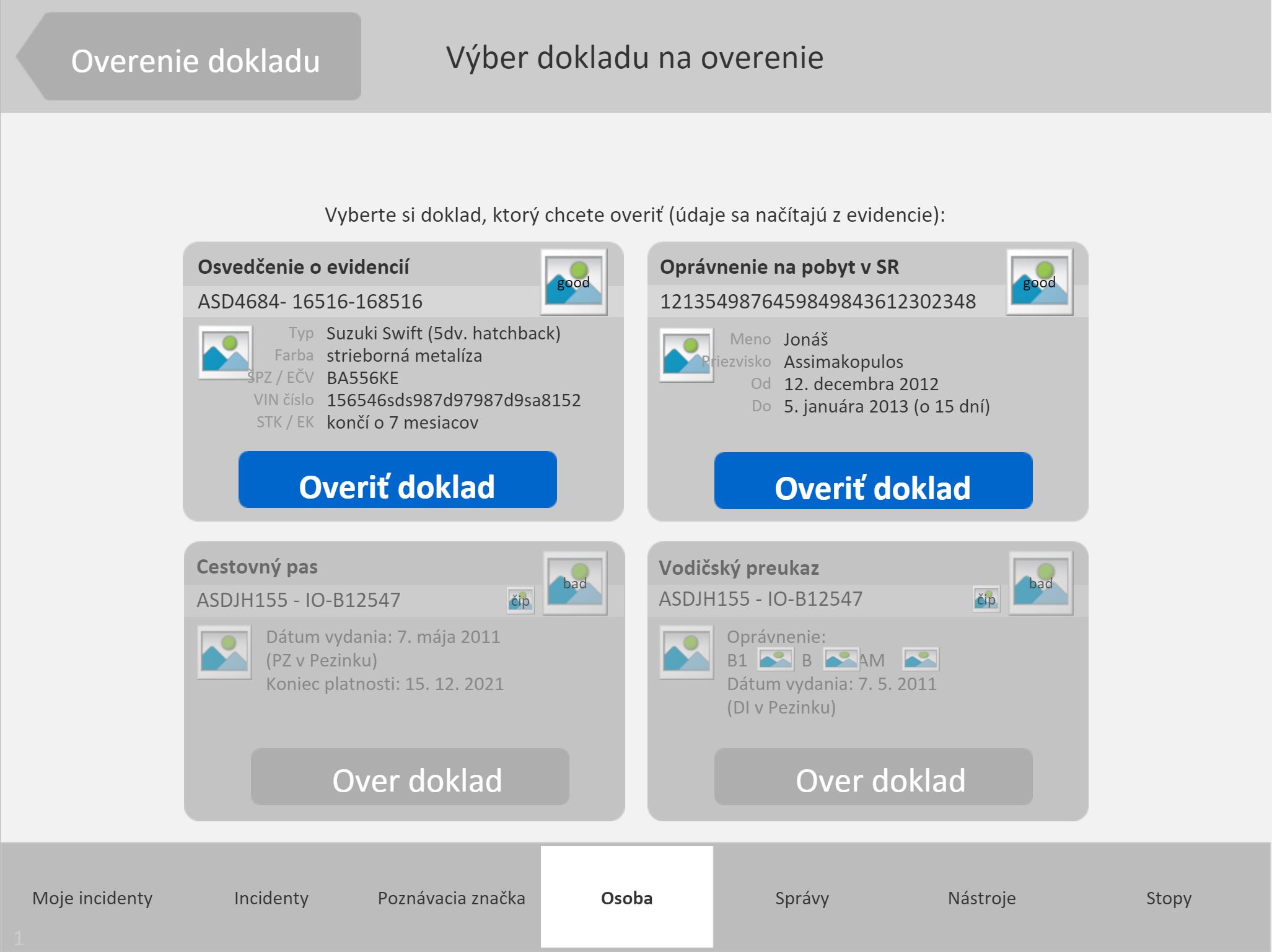
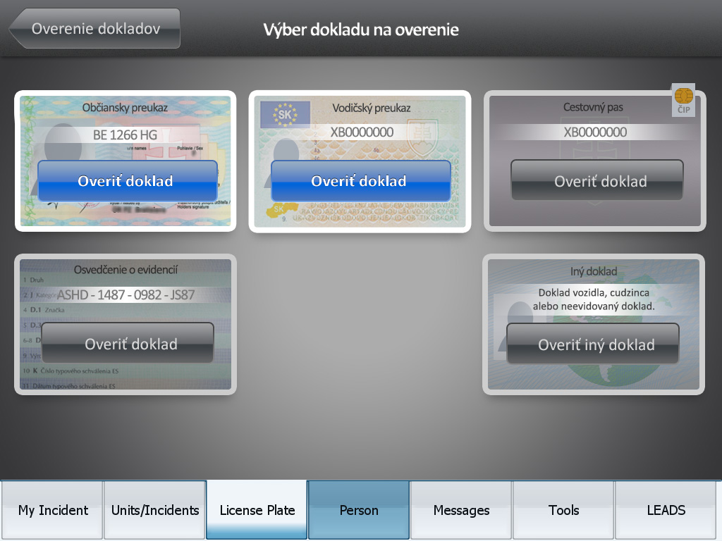
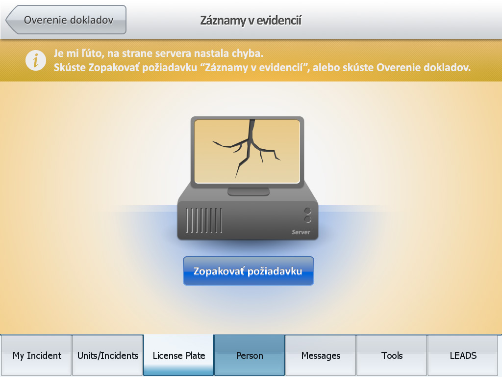
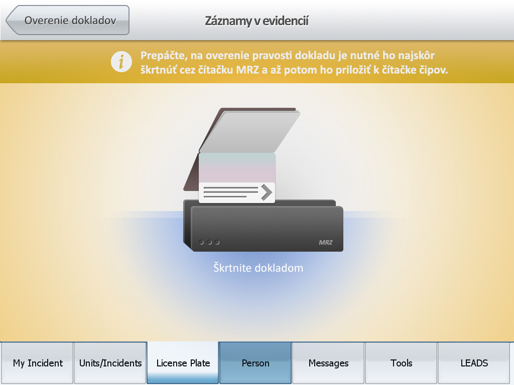
The National Car Registry (NCR) project began as a touch-enabled dashboard panel installed in police cars. It allowed officers to scan documents and perform background checks in international databases within seconds. The existing system had a complex information architecture with over eight layers of navigation, which needed simplification for better usability.
Solution
Starting from scratch, I developed a new, flatter information architecture that allowed for better scalability and more flexible, reusable UI elements. The redesigned interface featured a metaphor of a hand holding IDs, visually representing the documents that needed to be checked.
This approach aimed to provide clear guidance and feedback to users, enhancing the overall interaction experience.
"Jules brought 'new wind' into our application. His ability to solve customers' requirements in line with UX principles is amazing. Project NCR also won ITAPA price and this is also his reference."
- M.Dudlak, Senior Project Manager
-
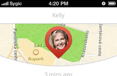
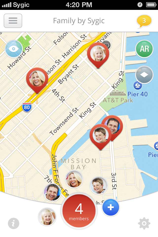
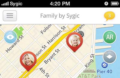 Basic map view - displaying where your family members are in the real time.
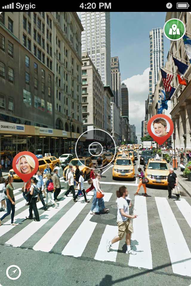
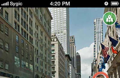 To help family members to meet we introduced the 'augmented reality' overlay.
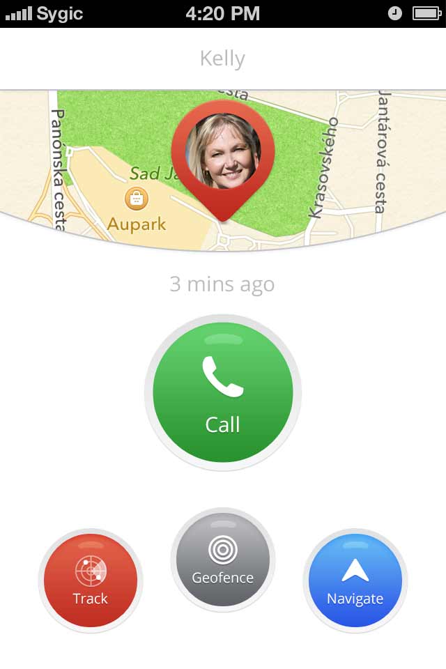
 A quick way to call or message family members right from the interface.
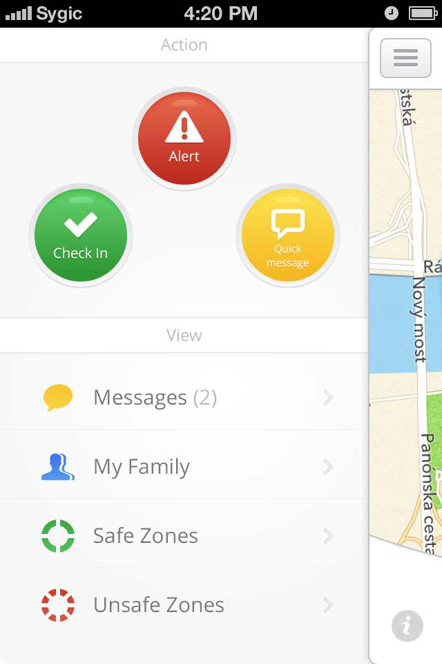
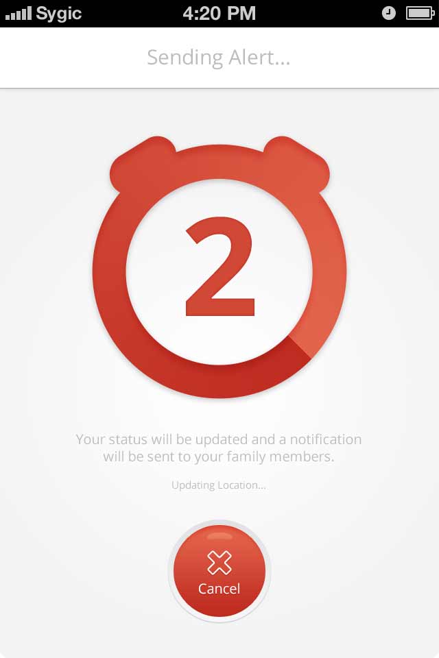
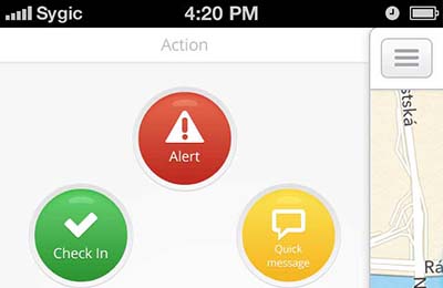 Application menu with dominant emergency button.
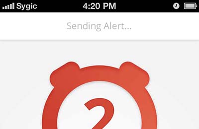 Alert triggered lets you cancel it within the 5s countdown if pressed by mistake.
 Gamification layer was introduced in the first beta version and boosted engagement and time spent in application a lot.
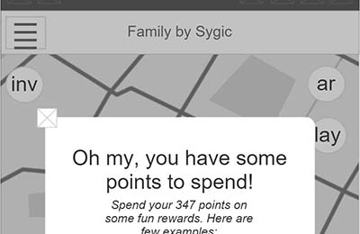
Discovery
Family locator is a safety-first app to help parents know where their kids are at any given moment. The beta release revealed a lot of technical as well as usability problems. Product manager Martina Maslejova asked me to pinpoint these moments of friction. Later, I was on a mission to figure out various monetization schemes.
The customer journey map and user on-boarding was missing too. The brief was fairly general which motivated me to bring in some UX design treatment and allowed me to get a buy in for deep rooting gamification into the interactions.
Solution
Basic map view - displaying where your family members are in the real time.
To help family members to meet we introduced the 'augmented reality' overlay.
Customer journey map allowed me to see the best opportunities for monetization and opened many other options for additional user needs that can be turned into features. Gamification underlined this goal and daily and monthly engagement rates grew tremendously. Last time I worked on the app it had already more than 100k users.
A quick way to call or message family members right from the interface.
Application menu with dominant emergency button.
Alert triggered lets you cancel it within the 5s countdown if pressed by mistake.
An easy, fun and efficient way to keep an eye on the people you care about.
- Enejo Abdu, Google Play -
xManager: activity tracking
Productivity Strategy B2B Mobile Craft Highly-regulatedFebruary 1, 2013 | KFB Learn more
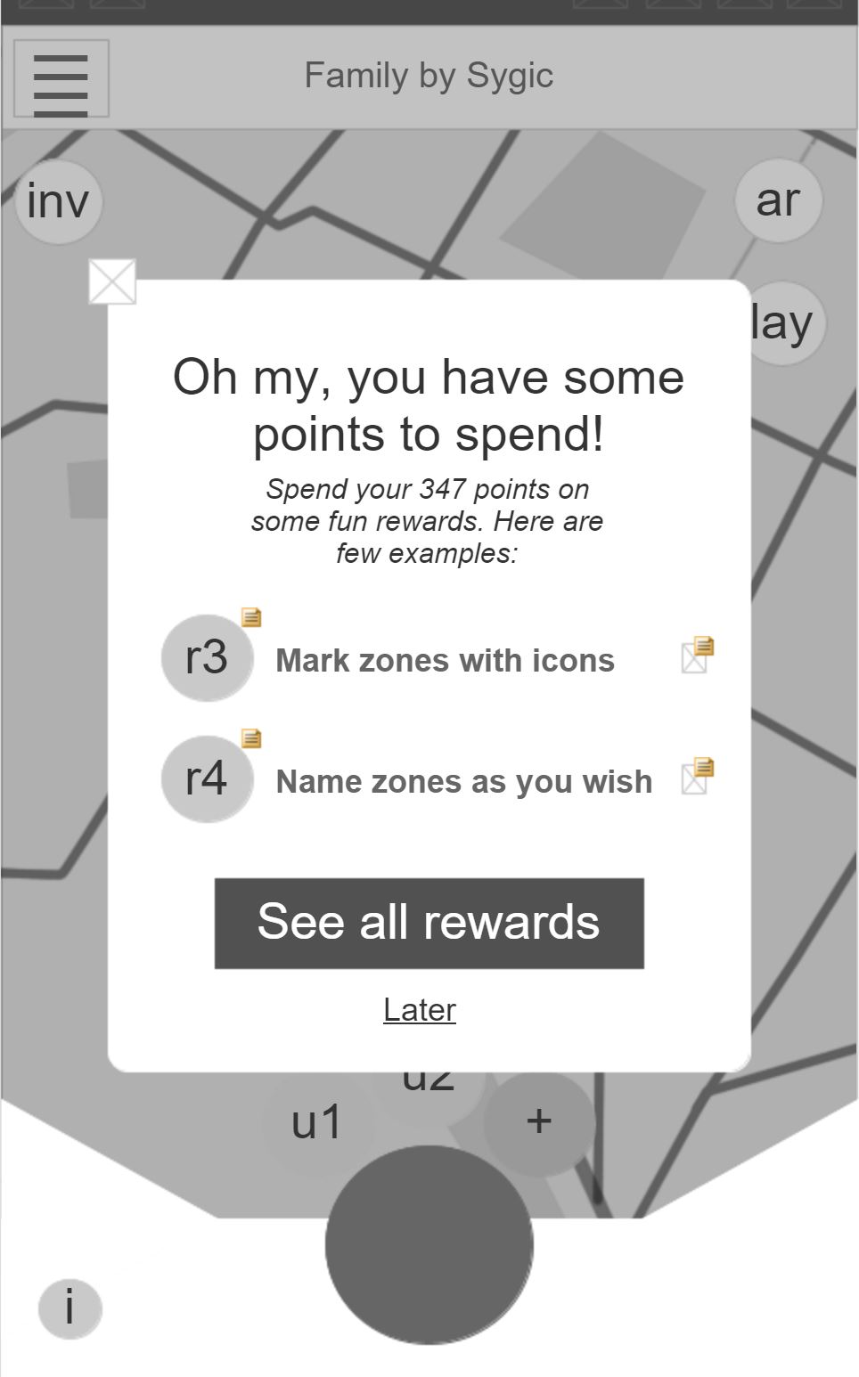
 Sitemap and analysis of current functions helped me understand where this software needs improvement and what just works fine.
 Lab testing identified key problems in the prototype and influenced the final UI designs.
 Usability testing was streamed right to the business stakeholders.
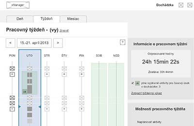
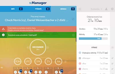
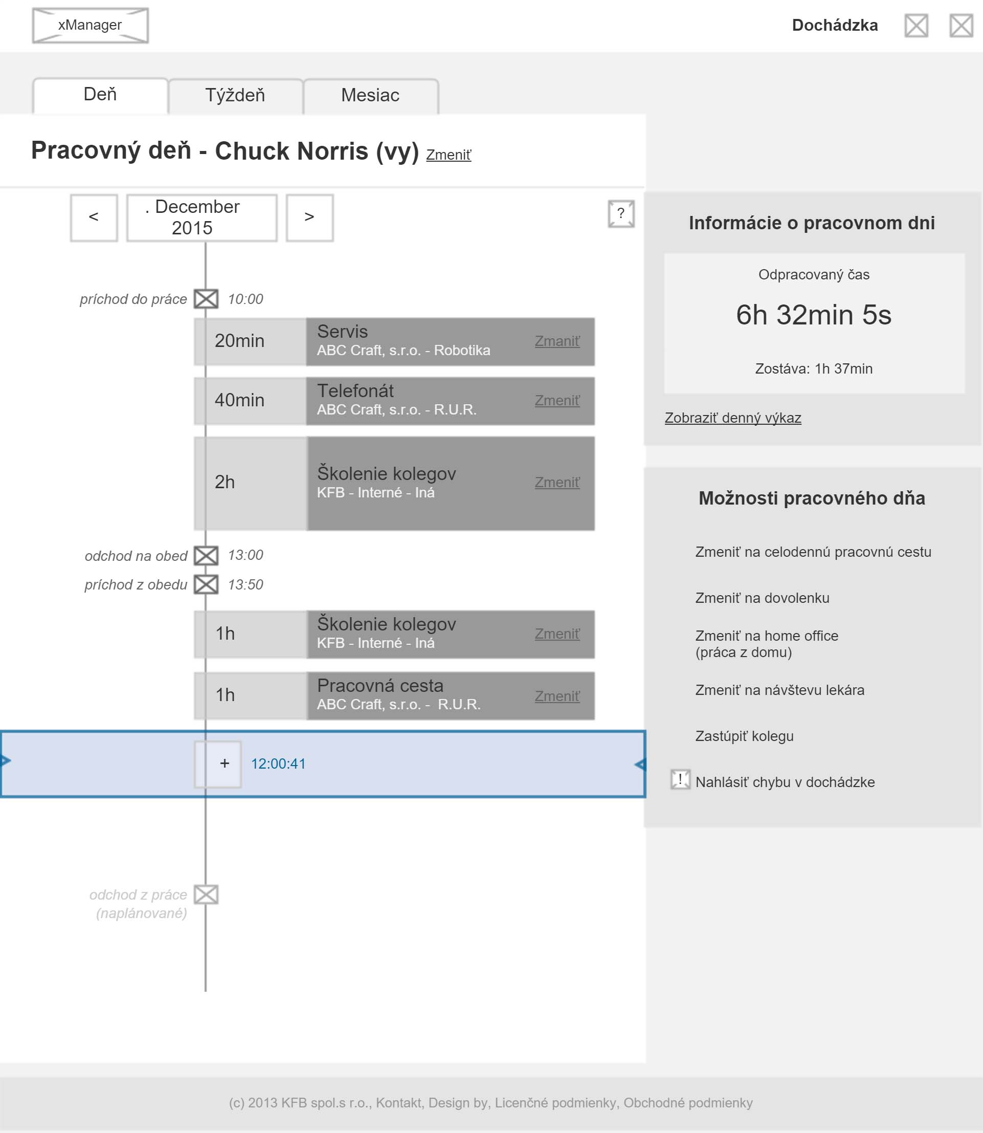
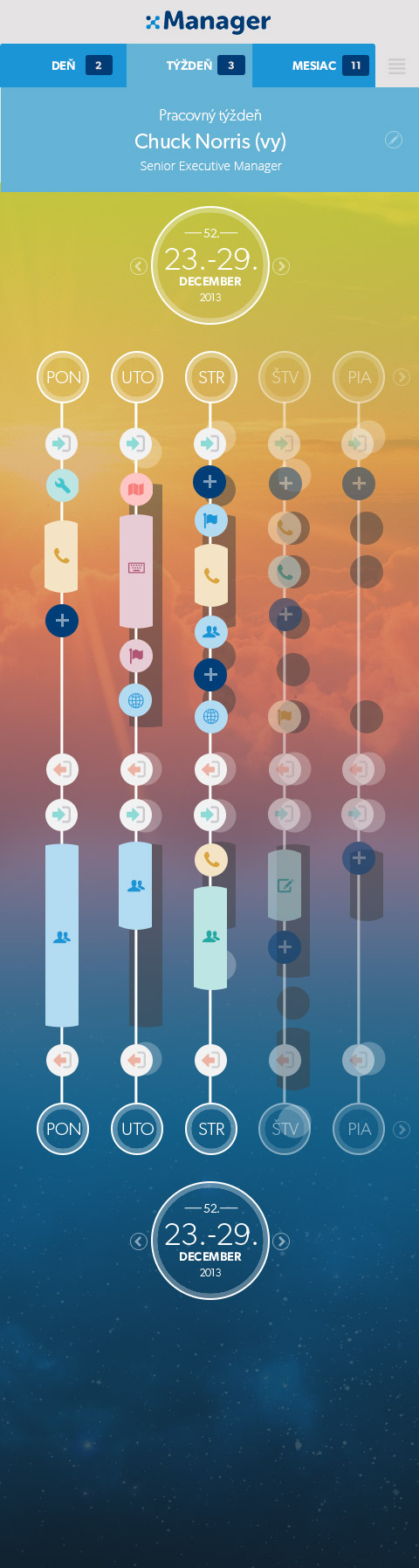
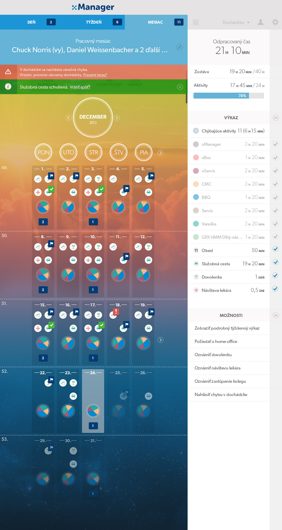
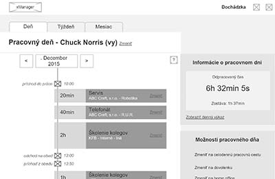 The idea of the timelines and the time spent on the tasks in a relative scale.
 Single employee's timeline with an error message.
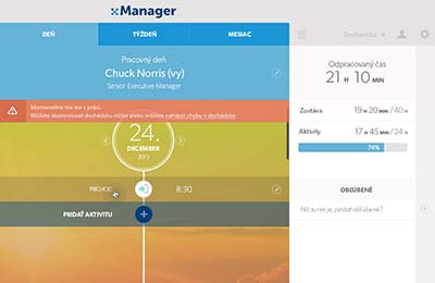
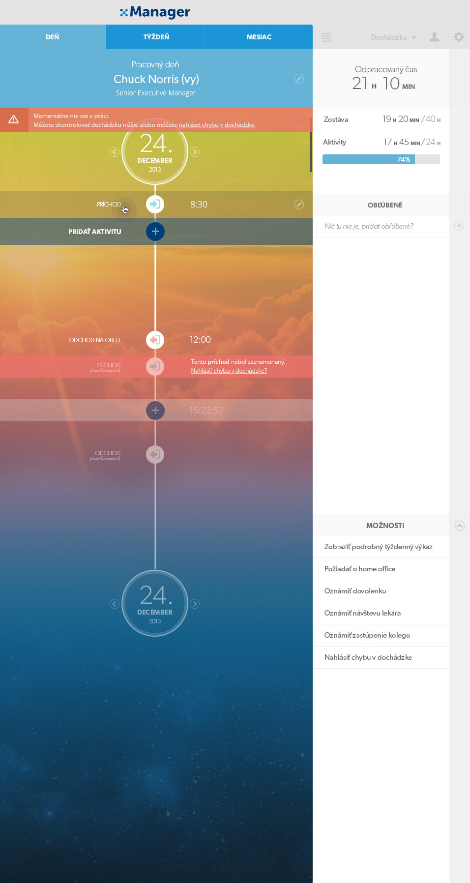
 Single employee's timeline over the week - prototype.
 Single employee's timeline over the week - mock-up.
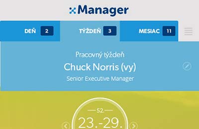
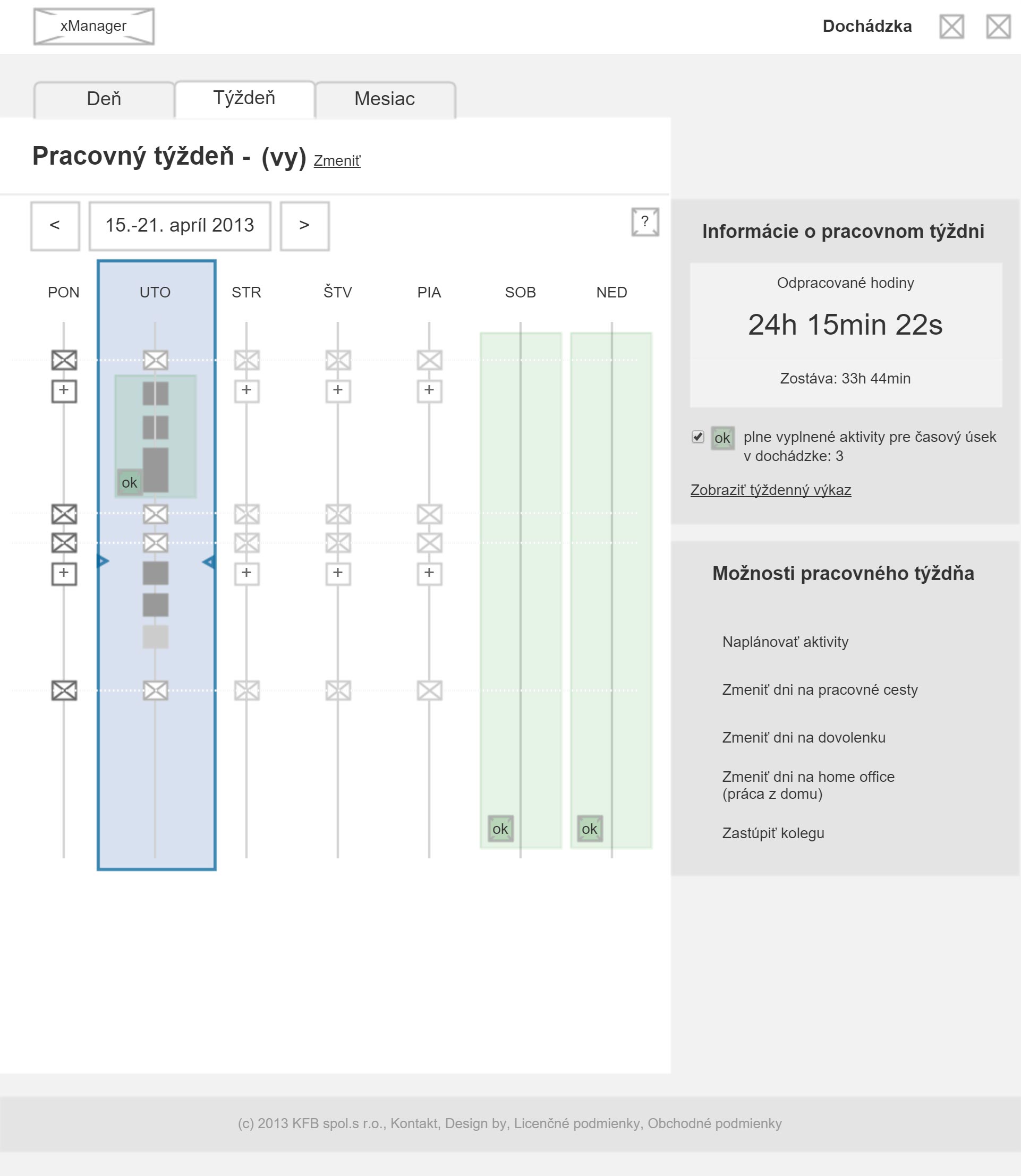
 Month view - prototype.
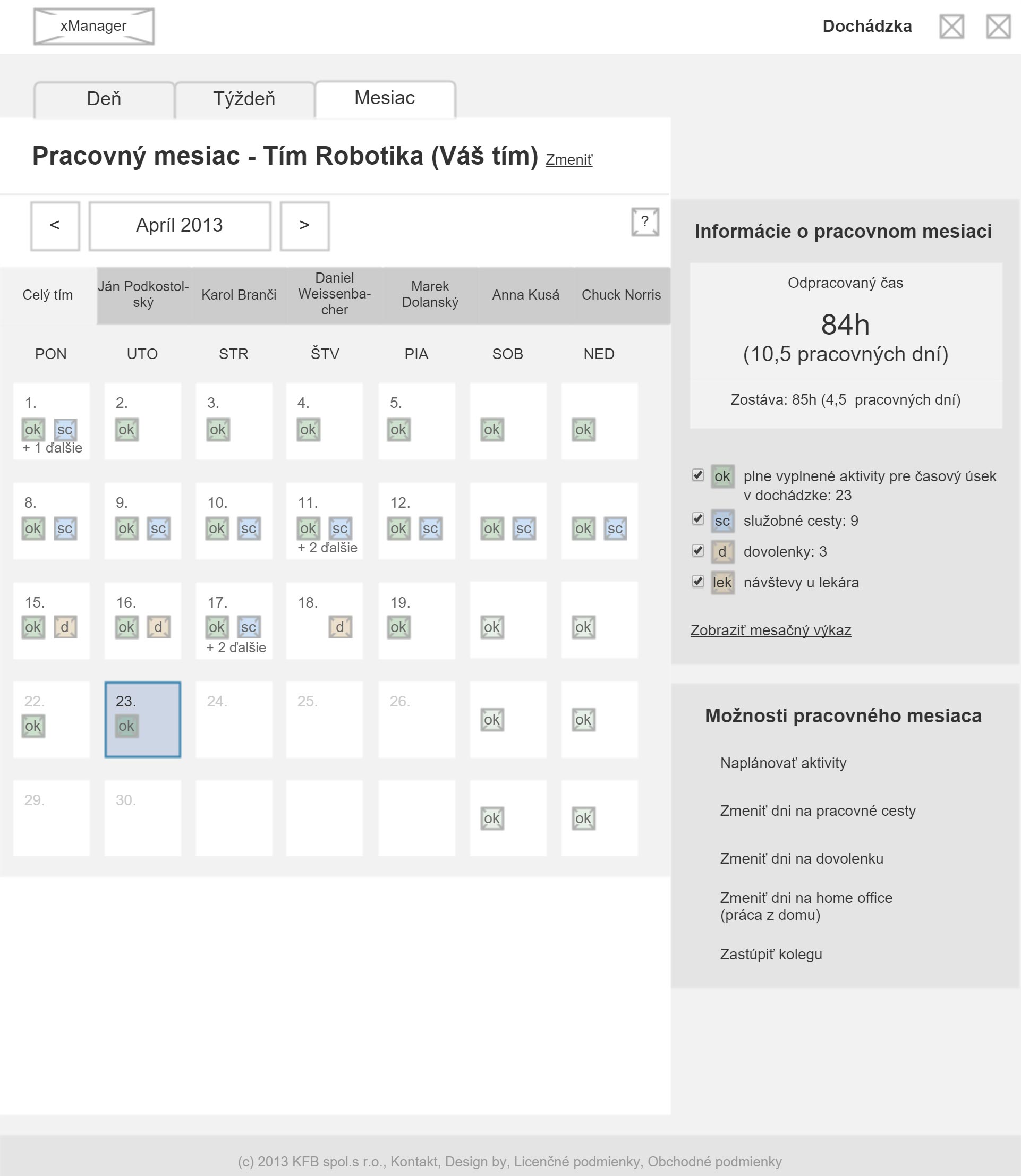
 Month view - mock-up.
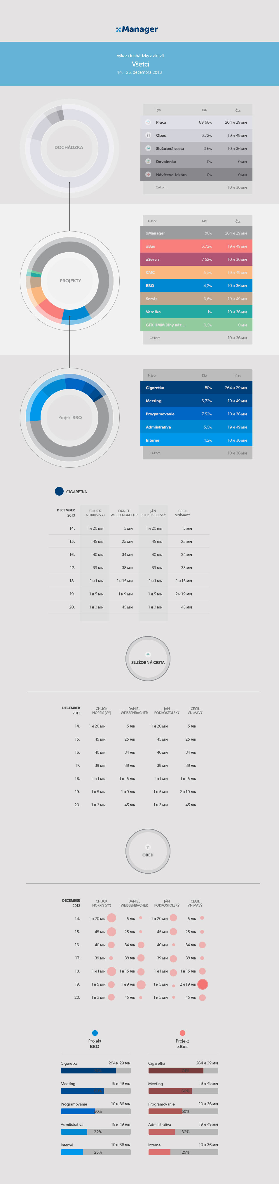
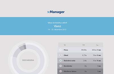 UI styleguide used for reports.
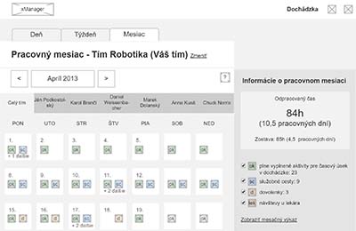
Discovery
KFB is a supplier of the activity tracking software for large automobile factories (think 4000+ employees). The last version of the application was full of features that were barely used. The functions were in place but they weren't accessible.
Sitemap and analysis of current functions helped me understand where this software needs improvement and what just works fine.
Lab testing identified key problems in the prototype and influenced the final UI designs.
Usability testing was streamed right to the business stakeholders.
A new interface was needed to be designed carefully - that's why KFB decided to go with safer approach and employ qualitative research upfront.
Solution
The idea of the timelines and the time spent on the tasks in a relative scale.
Single employee's timeline with an error message.
Contextual inquiries, stakeholder interviews, need-finding sessions as well as observational studies were carried out in the first phase of the full-flanked qualitative research over the first 3 months. Followed up by personas and user journey mapping serving as a solid foundation for information architecture. Last 4 months of the project were dedicated to user interface design.
Single employee's timeline over the week - prototype.
Single employee's timeline over the week - mock-up.
The results were more than positive - system usability score of more than 80% was a promising start for moving into production with full confidence.
"Visualizing the data this way really helps!"
- Jindrich Vidensky, Senior Manager -
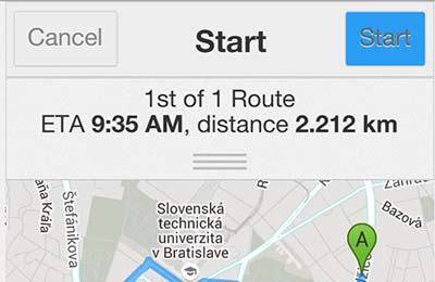
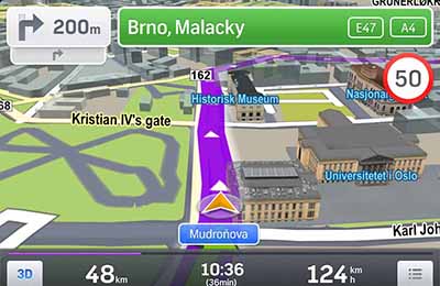
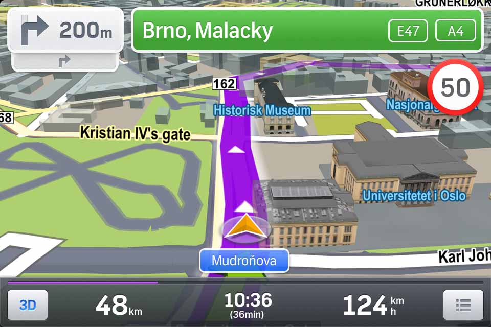
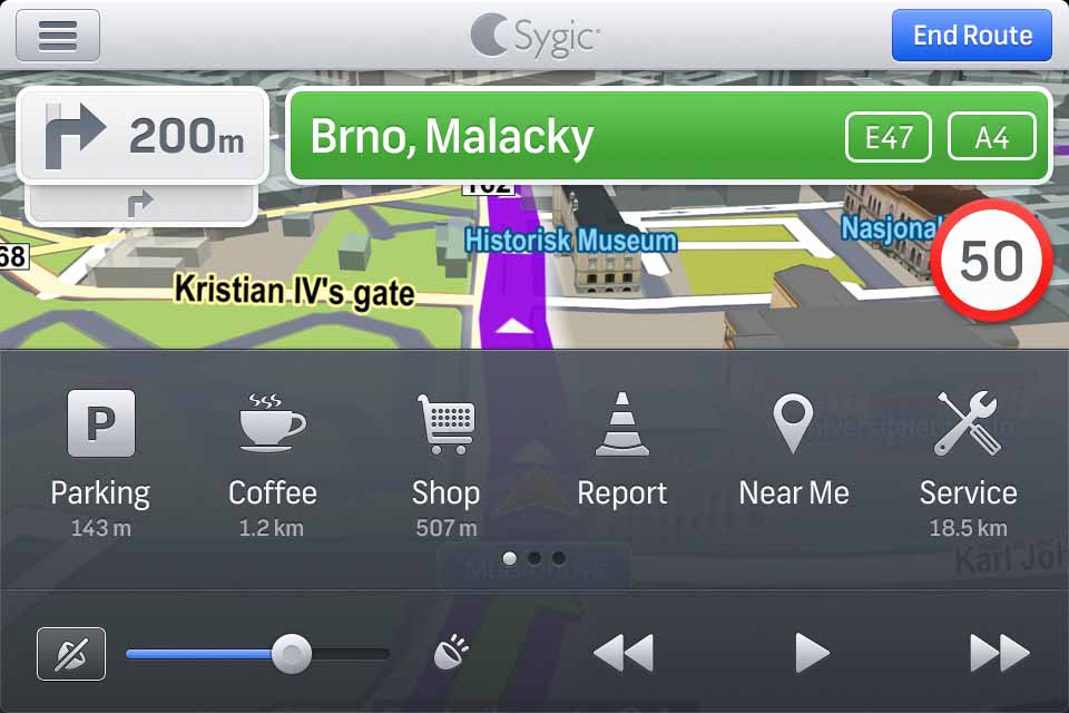
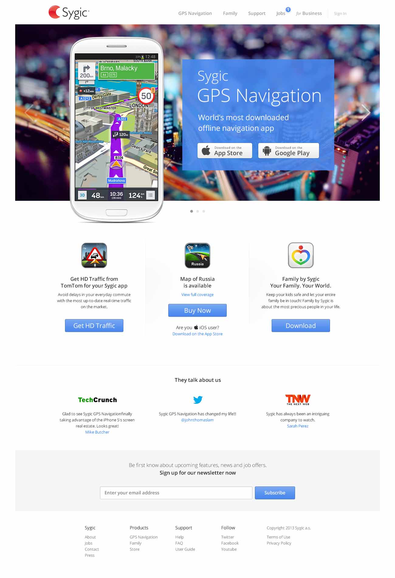
Sygic GPS Navigation
Maps Strategy B2C Mobile Craft Marketing HCIDecember 1, 2012 | Sygic Learn more
 Interactive prototype that I've built on JavaScript and was used over all our qualitative research sessions.
 Interactive prototype - search.
 Landscape mode of the navigation screen as designed by our small internal design lab: Juraj Rosa, Stanislav Luzbetak, Rastislav Gartner and me.
 Quick menu to access all the additional features unique to Sygic GPS Navigation.
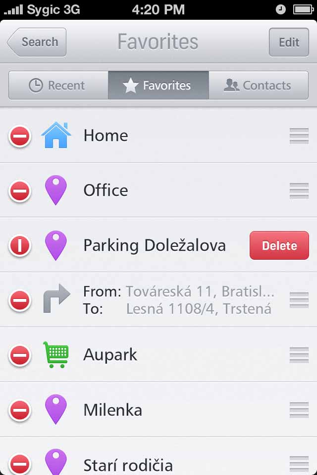
 Lists of saved locations - an example how much we were following the iOS platform conventions at the time.
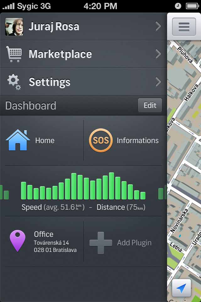
 Main menu including flexible layouts for addons and plugins build on Sygic's proprietary platform.
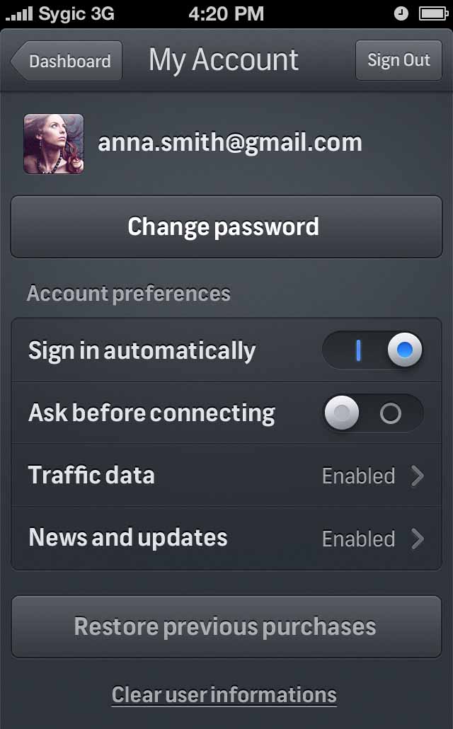
 Personal settings.
 Searching for destination was considered one of the most innovative ways at the time (this was before Google maps came with very similar search user flow).
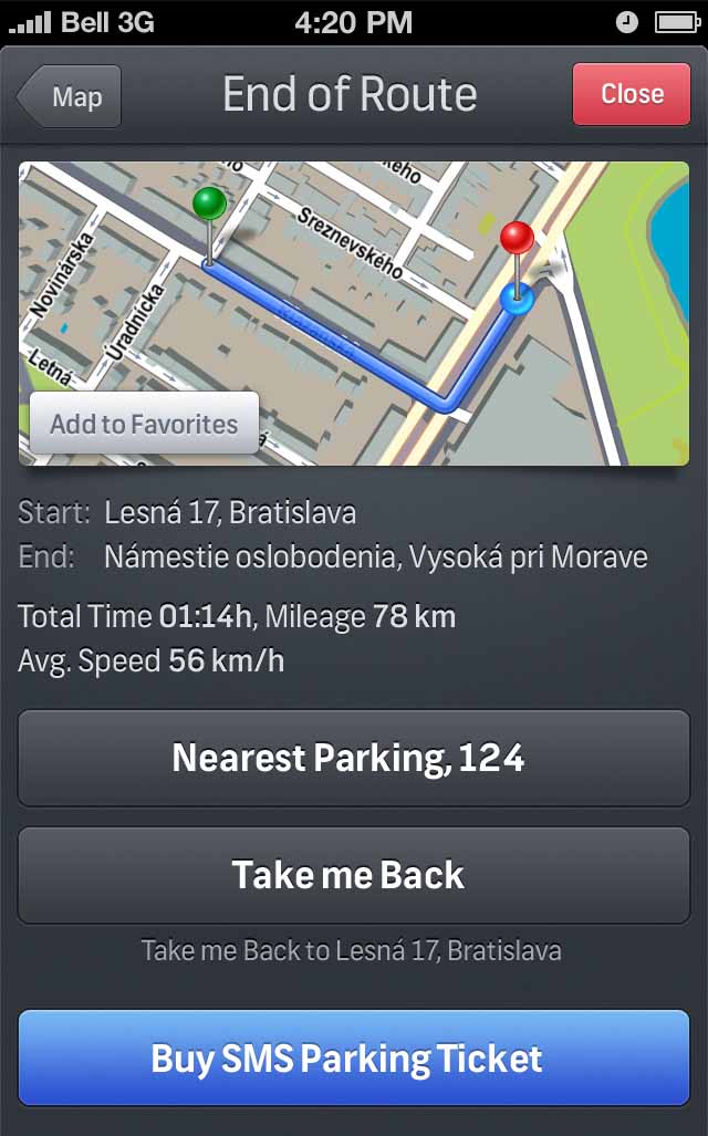
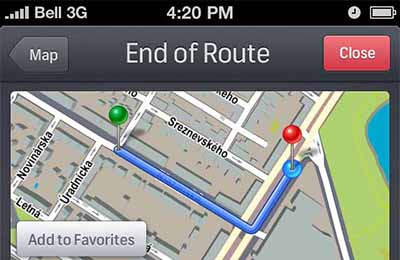 End of route provides additional ways how to monetize and crosssell the location based services.
Discovery
I joined the company as a UX designer to start working on a big (secret) project that was just kicking off. A GPS navigation that would conquer the market.
In collaboration with senior UX designer Juraj Rosa we have held several brainstorming sessions with key business stakeholders and organized numerous qualitative research sessions (taxonomy, info architecture testing, usability testing, field testing, contextual inquiries etc.).
Solution
To get a better understanding of the design problems I built an interactive JavaScript prototype that was used on usability testing sessions (which I was also facilitating).
Interactive prototype that I've built on JavaScript and was used over all our qualitative research sessions.
Interactive prototype - search.
Landscape mode of the navigation screen as designed by our small internal design lab: Juraj Rosa, Stanislav Luzbetak, Rastislav Gartner and me.
Quick menu to access all the additional features unique to Sygic GPS Navigation.
It took a year to get the application through the waterfall development cycle and half-way through iOS7 was released which meant a complete change from the traditional skeuomorphic to flat design. I led the transition to the new flat UI and implementation of the new interactions.
Lists of saved locations - an example how much we were following the iOS platform conventions at the time.
Main menu including flexible layouts for addons and plugins build on Sygic's proprietary platform.
Personal settings.
Lastly, by evangelizing UX practices within the company and being responsible for correct implementation of the UX design we managed to create an application that would dominate the market in the upcoming years. At the time of writing the application was downloaded 110 million times.
-
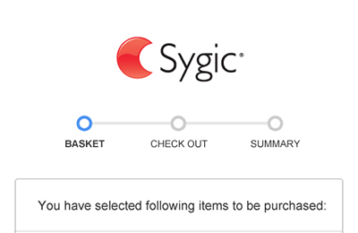
 My first assignment was our online shop. This is a shopping cart wireframe.
 HTML prototype helped front-end team to easily implement the solution within a single week sprint. The designs were provided by designer Jakub Ptacin.
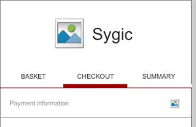 Step 2 wireframe.
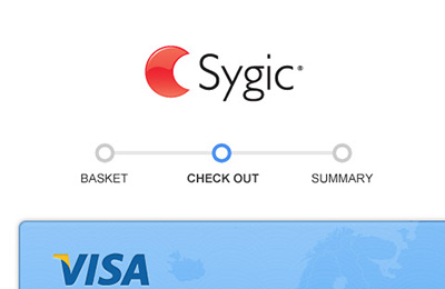 Step 2 interactive HTML prototype.
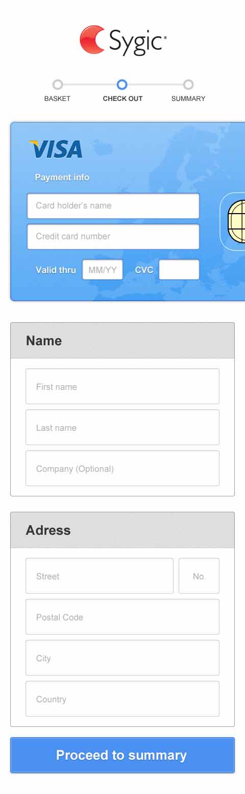
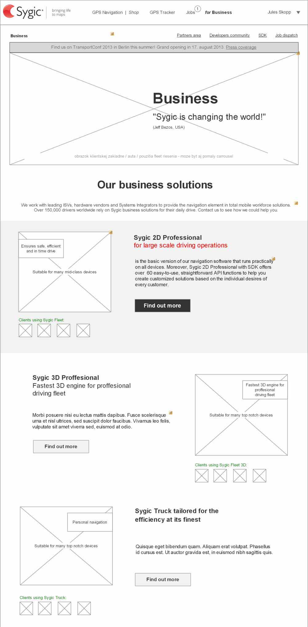
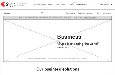 'Sygic.com for Business' - large scale project involving an entire division of the company and plenty of stakeholders. A lot of facilitation was needed to get a go on this one.
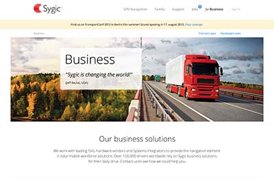 A mock-up of business part of the website.
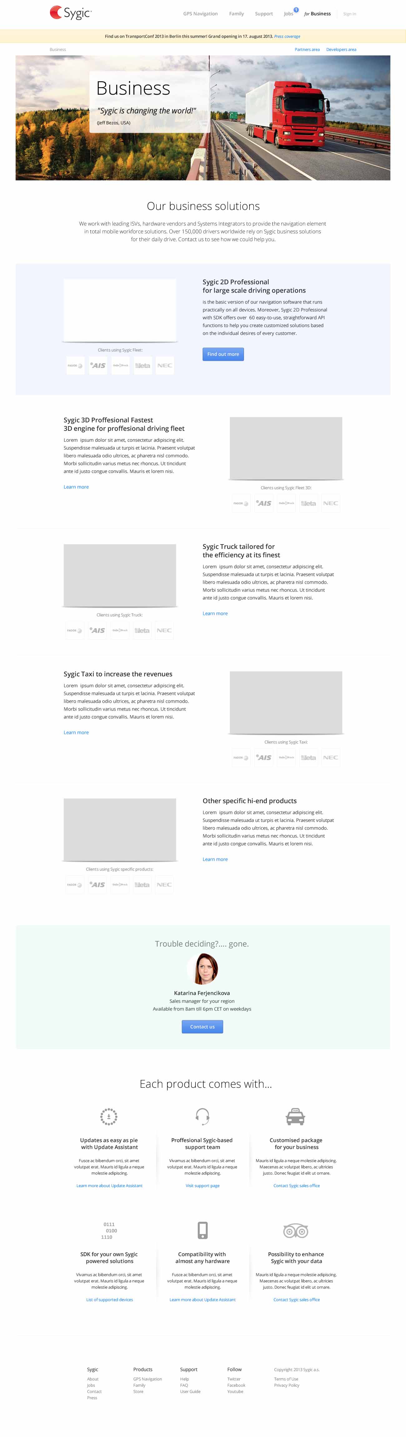
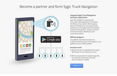 I have created a concept of axonometric views of the devices to better explain how the navigations works with large fleets.
 And finally the homepage as an entry point to the conversion funnel.
Discovery
My first big project at Sygic was to analyze existing customer journey and identify weak points and potential opportunities.
The second project was to build a business section from scratch as the company organization had changed. Lastly, I was asked to optimize the homepage and its funnel to increase overall conversions (volume but also business impact).
Solution
I identified mobile shopping to be cumbersome and prone to many user errors. By a series of tweaks I managed to lift mobile conversions by approximately 40% (rough estimate as I did not have access to exact figures).
My first assignment was our online shop. This is a shopping cart wireframe.
HTML prototype helped front-end team to easily implement the solution within a single week sprint. The designs were provided by designer Jakub Ptacin.
Step 2 wireframe.
Step 2 interactive HTML prototype.
Another notable project was the major web portal that I designed in collaboration with senior web designer Vincent Durbak. I was responsible for the B2B part and getting a buy-in from all the stakeholders.
'Sygic.com for Business' - large scale project involving an entire division of the company and plenty of stakeholders. A lot of facilitation was needed to get a go on this one.
A mock-up of business part of the website.
Finally, the homepage tweaks led to a much higher user engagement and reorganized info architecture (better findability). The creation of content strategy in collaboration with the marketing department turned our site into a rock-star high performer.
-
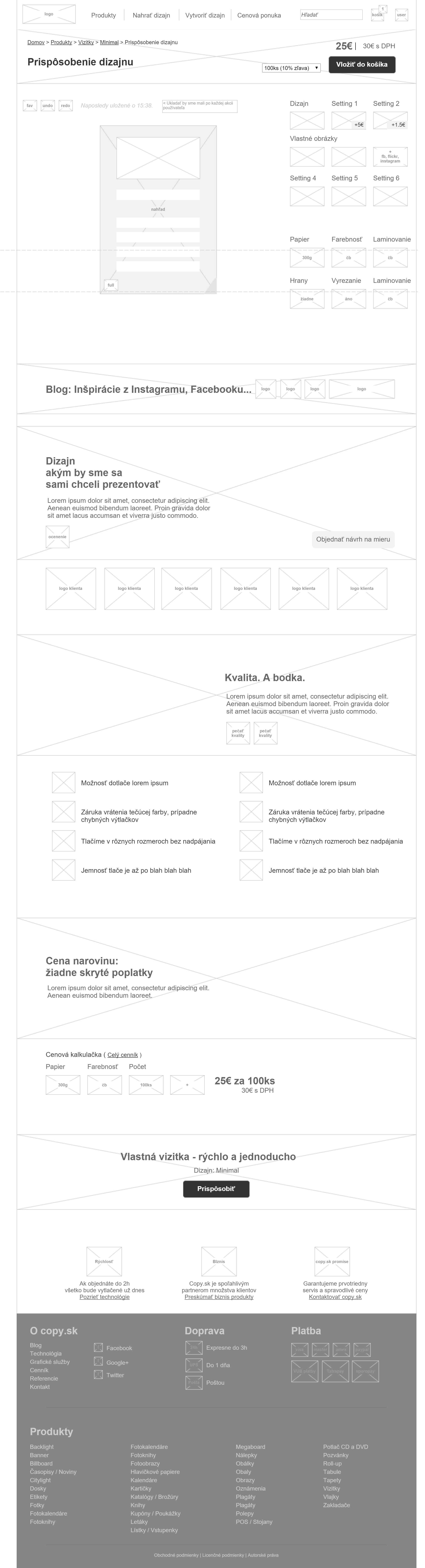
 Copy.sk web editor wireframe.
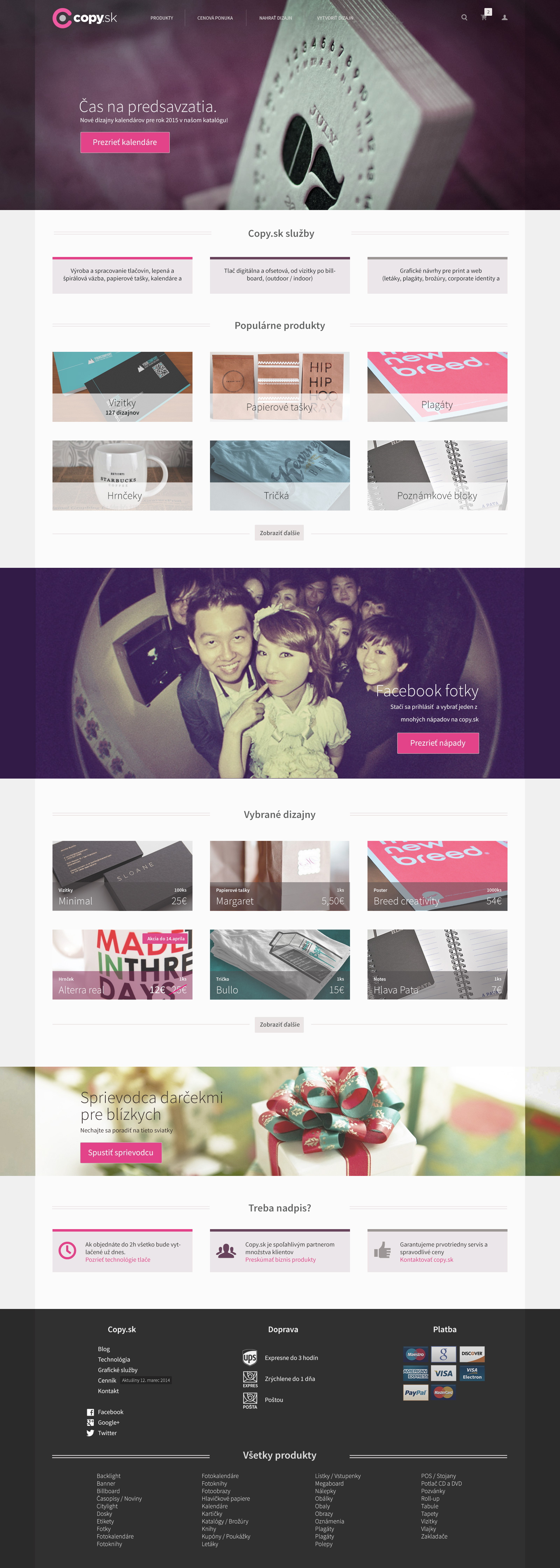
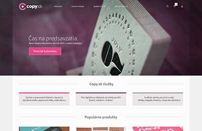 Copy.sk home page mock-up.
 ONCE - 'spacial' gallery browsing mock-up.
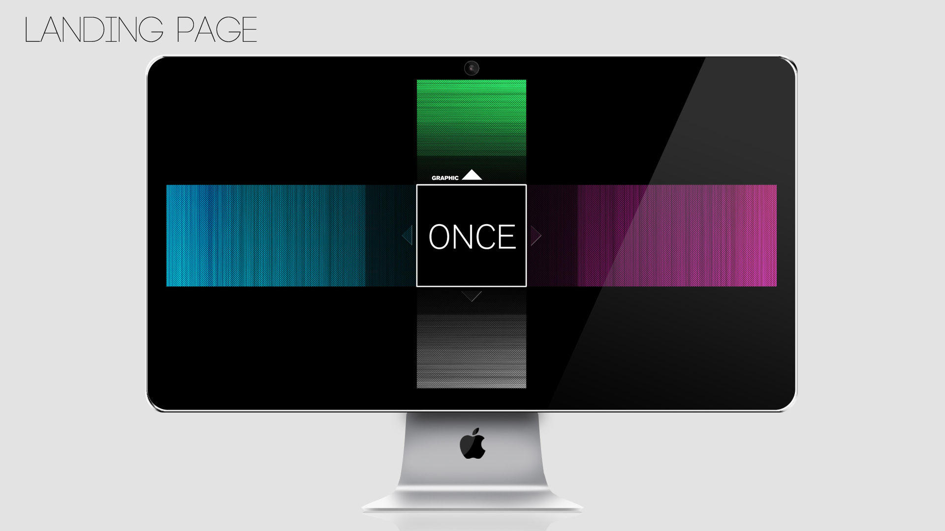
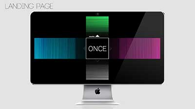 ONCE - landing page mock-up.
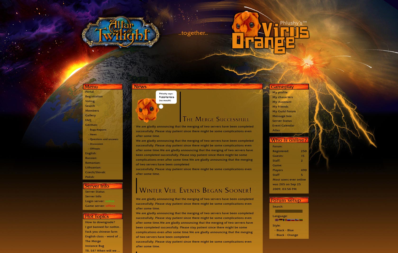
 Gaming server landing page.
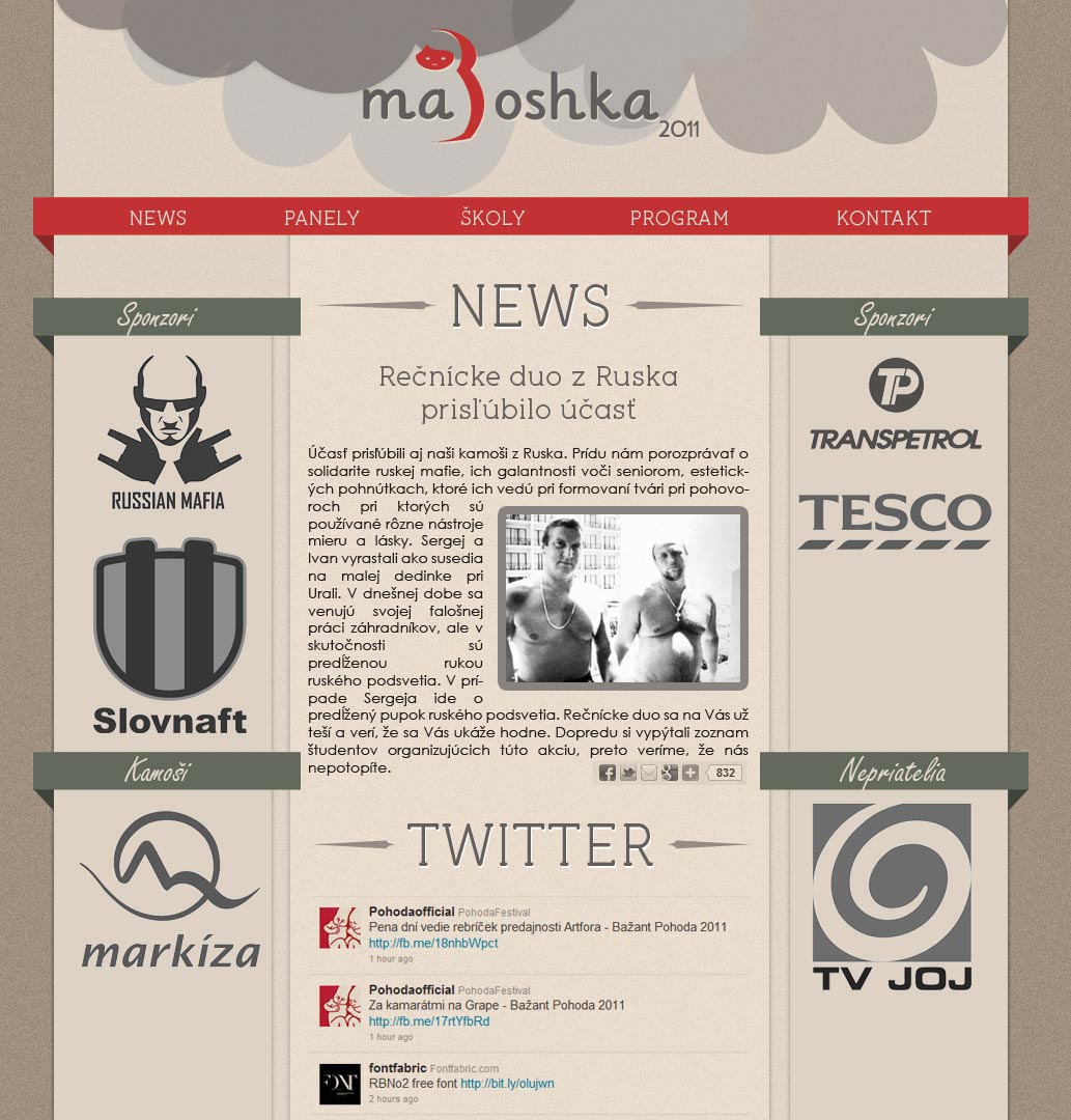
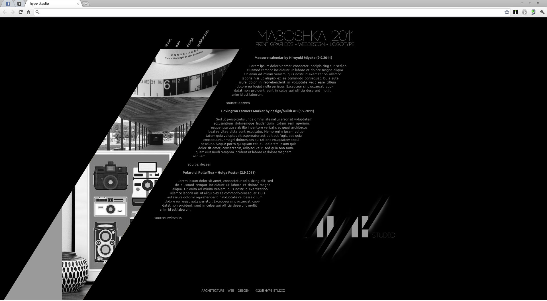
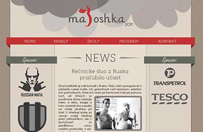 Ma-three-oshka conference home page.
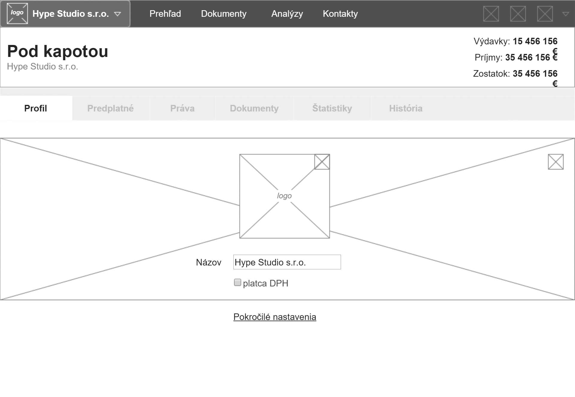
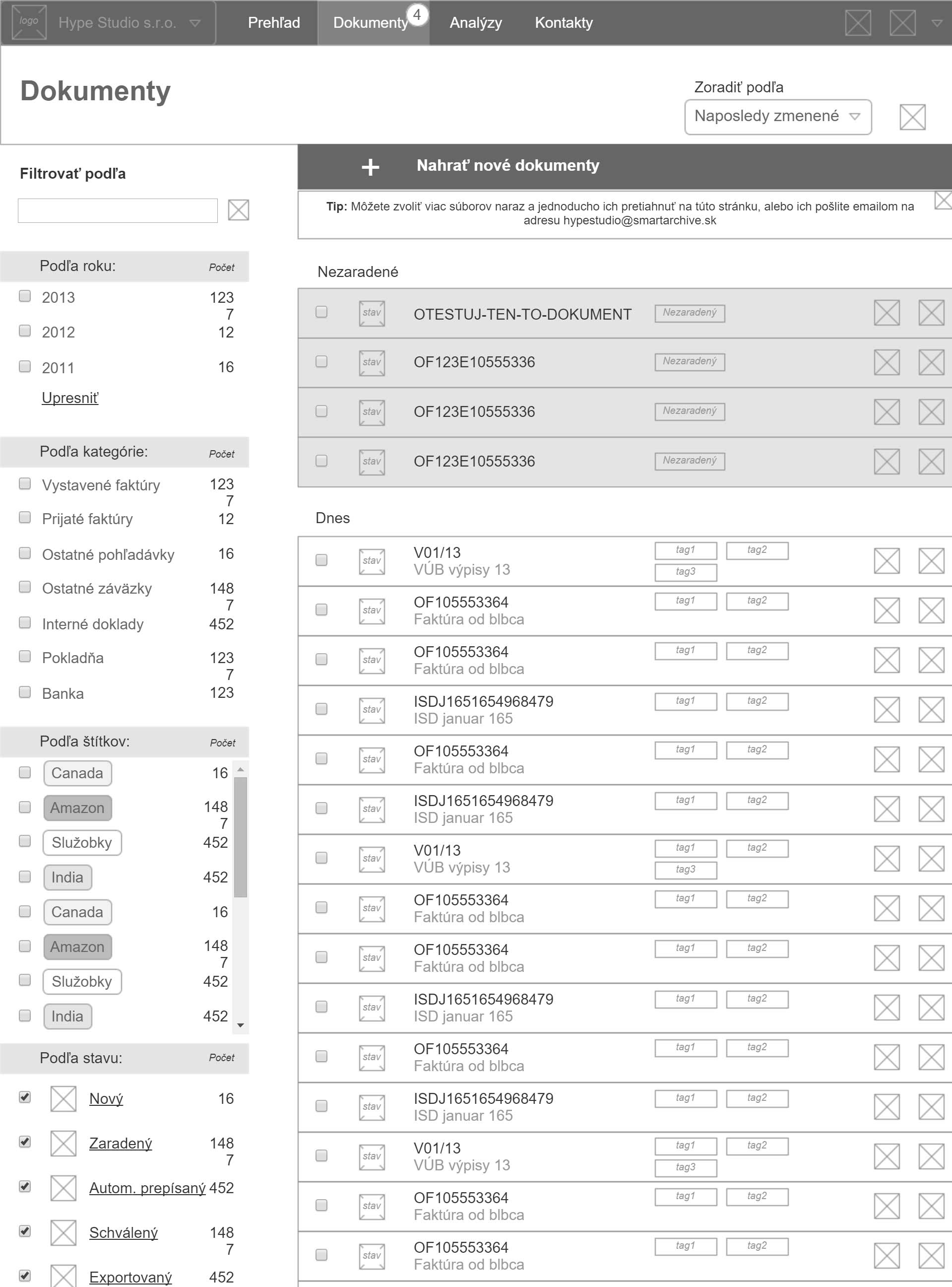
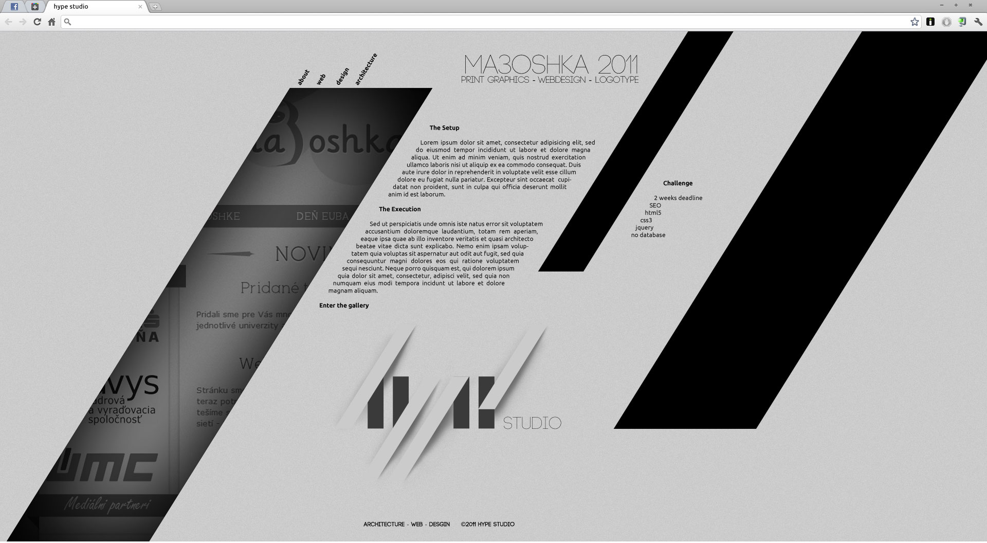
 Hype Studio project detail page.
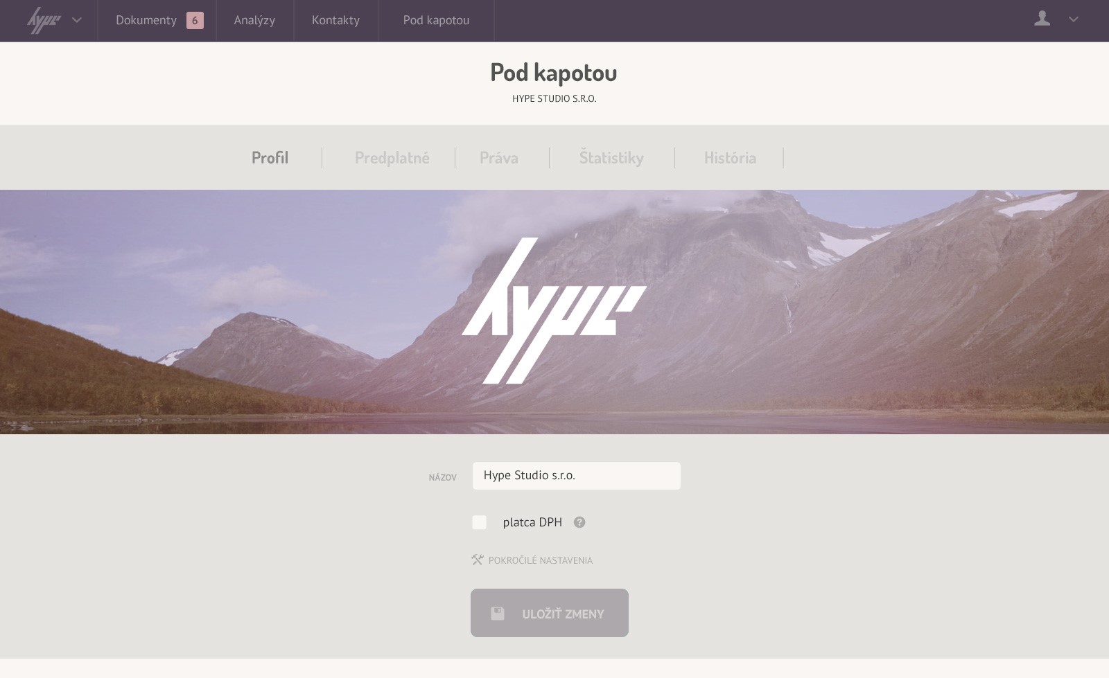
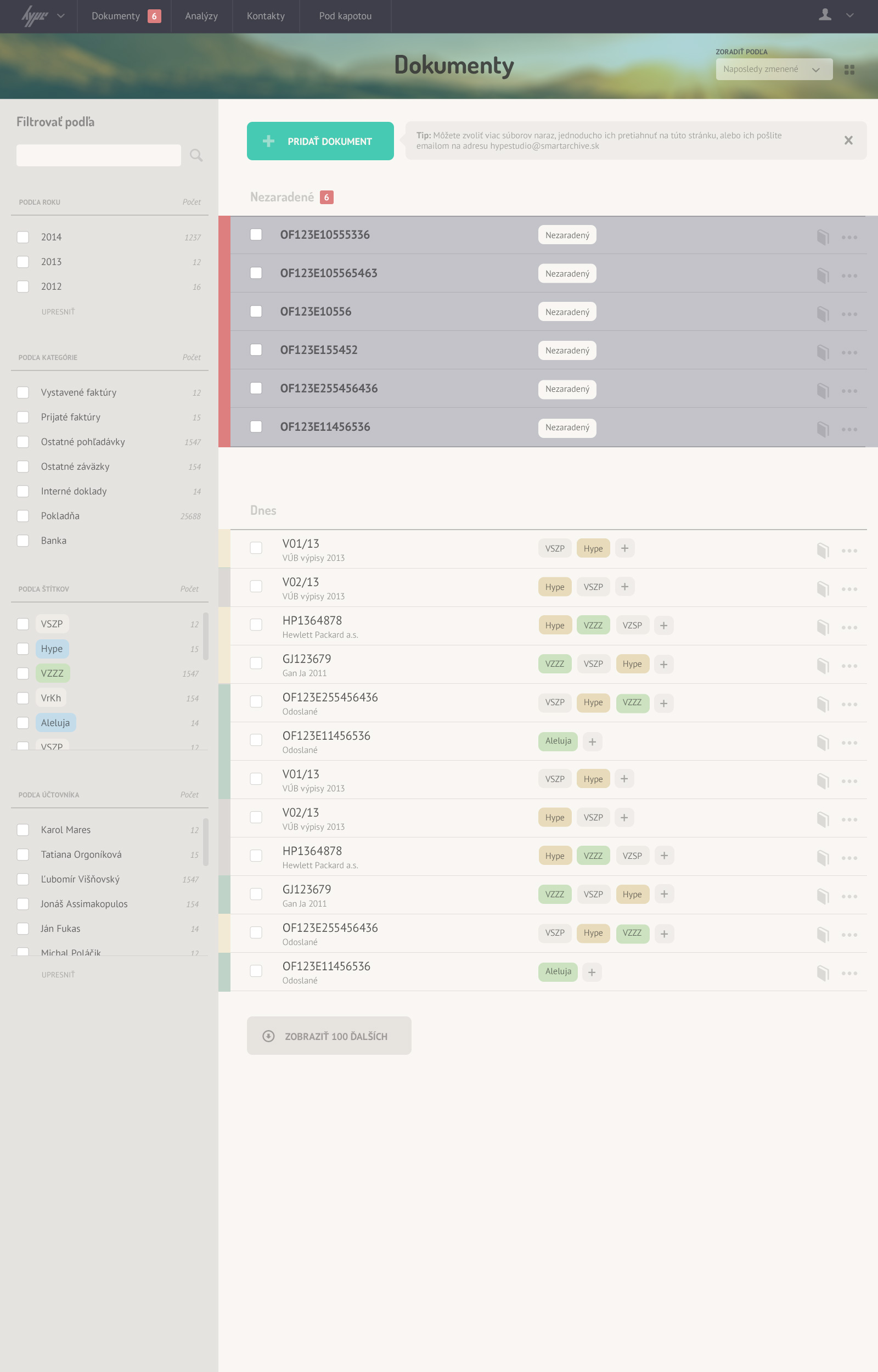
 Hype Studio project detail dark theme.
These were my projects in the early years of my career that are worth mentioning (most of these sites don't exist anymore):
Copy.sk: UX design for a self-serve print service.
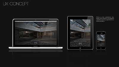
Once: Concept and web design for interior designer's portfolio.
DSV: UX, UI and database architecture for personal logistics service.
Idealmont.sk: Web design for a construction company.
Radnica.com: Web design and graphic design for a local restaurant.
Hype studio: Web design and brand identity for my consultancy company.
Retrocaj: Web design and graphic design for a university event.
Ma3oshka: Web design, brand identity for an international conference.
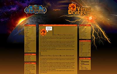
Statsys: Web design, content governance and database design for a gaming portal.
SPFASTU.sk: Web design for university organization.
Euglobs.sk: Web design, brand identity and database design for a real estate portal.
Domino: Graphic design, brand identity for a day-care.


Contact me
Thanks for reading through all that. If you're still interested in collaborating with me, please don't hesitate to reach out. You can always reach me at +41 78 603 31 32 (Swiss). If you wish to include more detail fill in the form below: